TechCrunch Article –
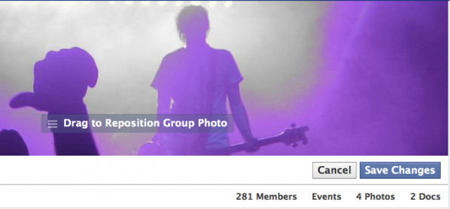
Facebook has rolled out a limited redesign of Groups, featuring a big new Timeline-style cover image, and a prompt for users to prominently label “What should people post in this group?” See, if you’re not careful, your intimate Facebook Groups can balloon in population and stray off topic generating annoying notifications for everyone.
This redesign makes Groups feel more close knit, and will encourage them not to devolve into a chaotic array of kitten photos, political diatribes, and self-serving announcements. After all, that’s what the news feed is for.
Groups previously displayed a small “group image” that admins could upload. I bet people often chose some generic clip art or a photo that appeared too tiny to be meaningful. Now the top of Groups looks more like Timeline, with a sweeping banner image that defaults to a collage of members but can be replaced with any image. Cleverly, the default collage shows the most recent members to post to the Group.
The redesign also makes links to members, photos, events, and docs more obvious. This is thesecond time Facebook has increased the prominence of these links to draw usage and compete with Google Docs as a collaboration tool.
Since Groups launched in October 2010 users have been able to add a description. However, they were provided no prompt as to what to enter, and likely just noted a theme rather than a purpose. Now a prompt and input field for group guidelines are immediately visible in the right sidebar.
This little prompt to display “What should people post” might not seem like a big deal, but if you’ve ever been in a big noisy Facebook Group, you probably wanted to tell everyone to shut up until you muted its notifications. Then you ceased to be alerted to the few useful posts and forgot all about the Group.
When I started a Group called SF Socialites soon after the product launched, I knew I had to keep noise to a minimum if people were actually going to use it to hear about cool local events. So I added the description “We keep posting volume low so you can leave notifications on. Check the Docs for guidelines”, then laid out ground rules in a doc that prohibited self-promotion, asked people to comment and post only when necessary, and detailed how I’d kick you out of my sweet Group if you annoyed people.
Eighteen months later and the group now has 280 members, no spam, and has led to some epic last minute meet-ups at concerts because people don’t mute it. Hopefully Facebook users heed the new description prompt, create focused discussion and collaboration spaces, and get as much out of Groups as I do.


