Category Archives: DESIGN
House in Abiko, Japan
Photographer: fuse-atelier
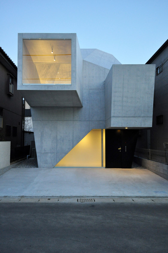
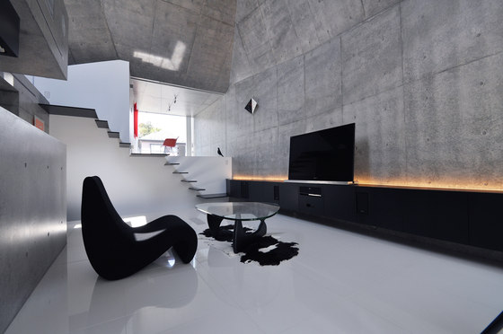
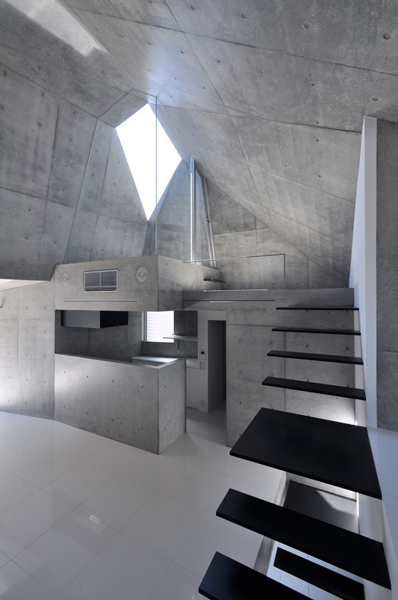
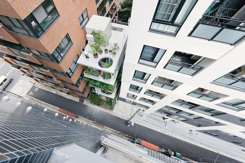
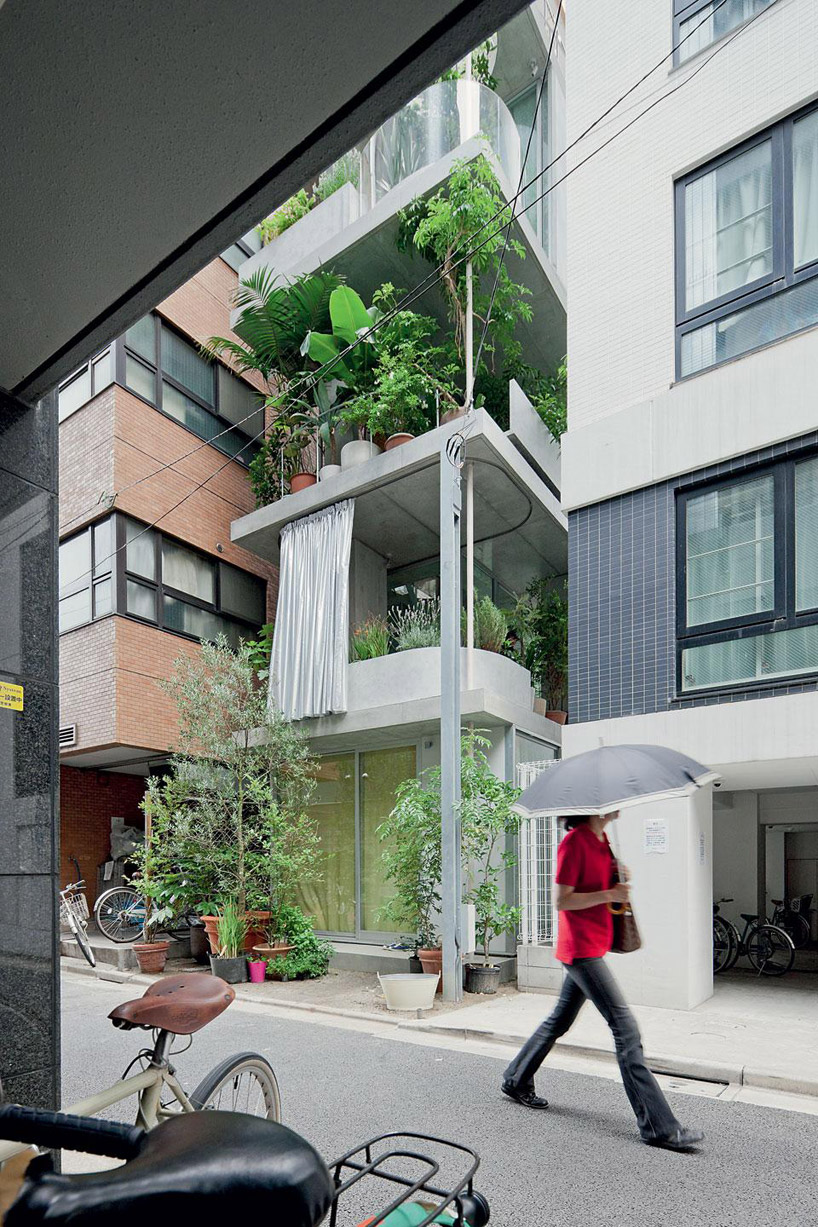
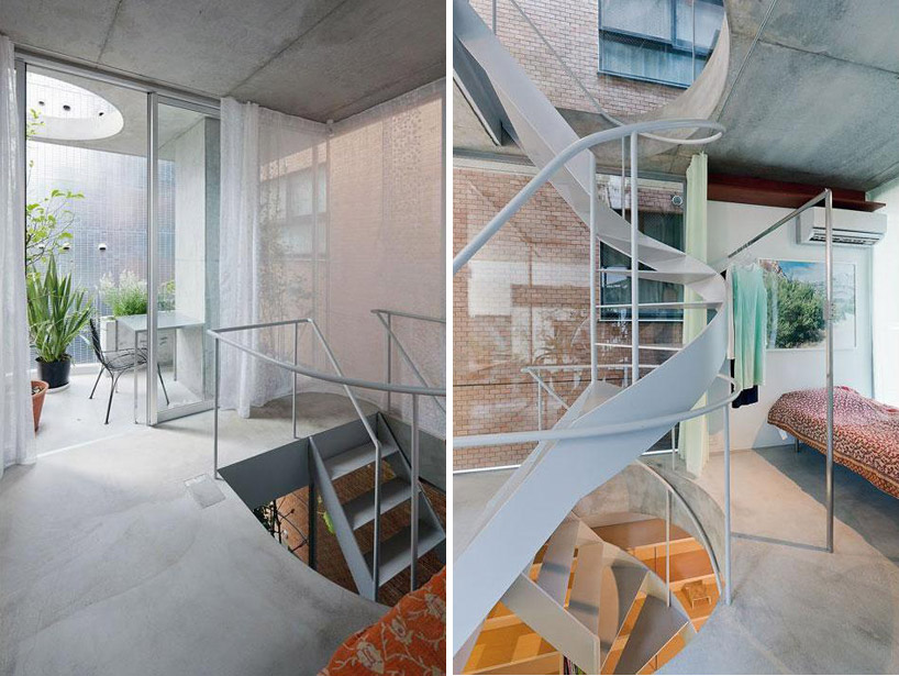
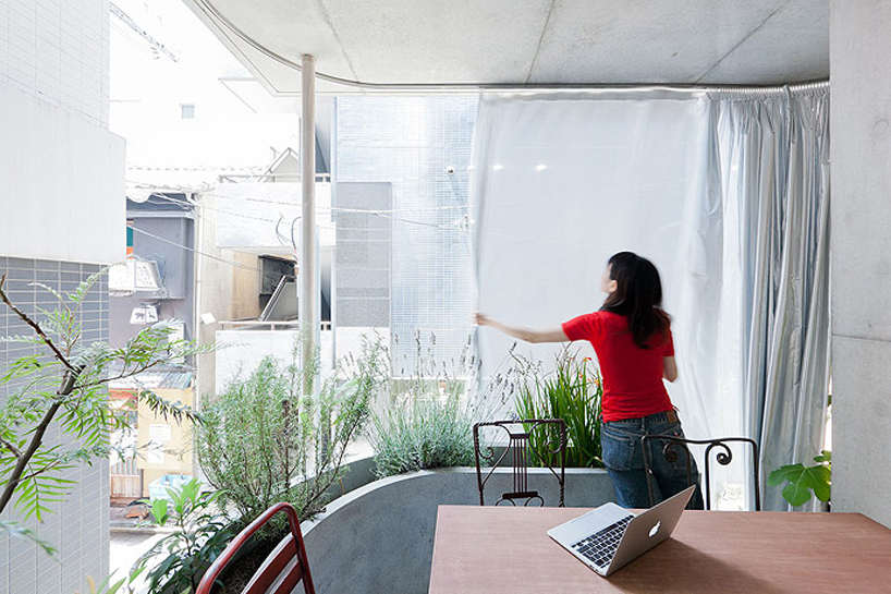
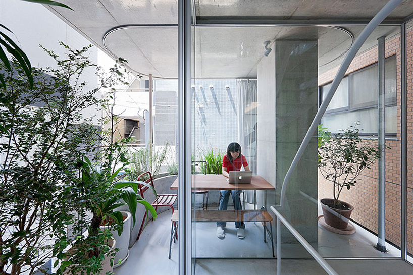
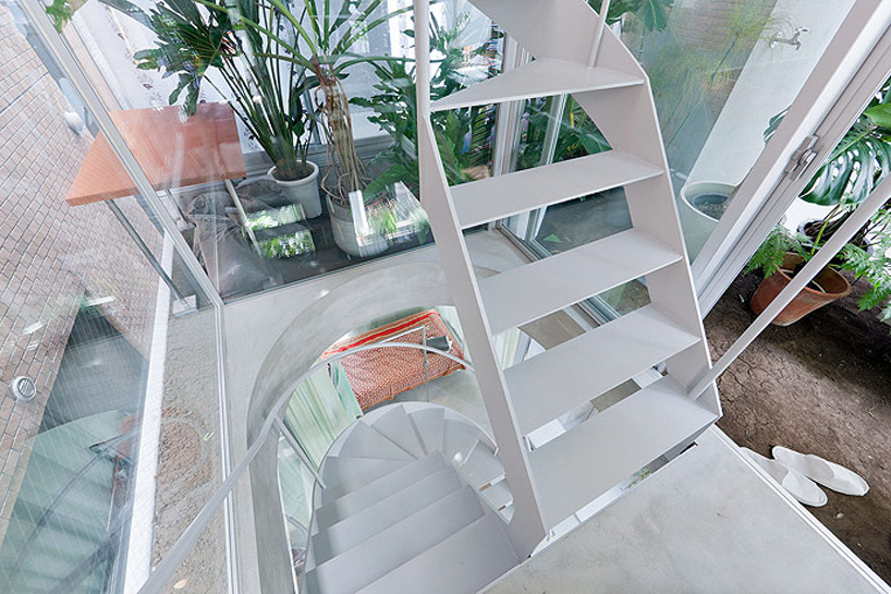
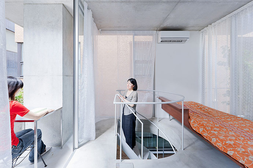
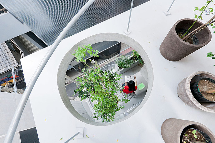
This project is a residence for a couple in their thirties, built in Abiko City. The client desired a gallery-like concrete-made space where their pleasure of designed furniture stands out.
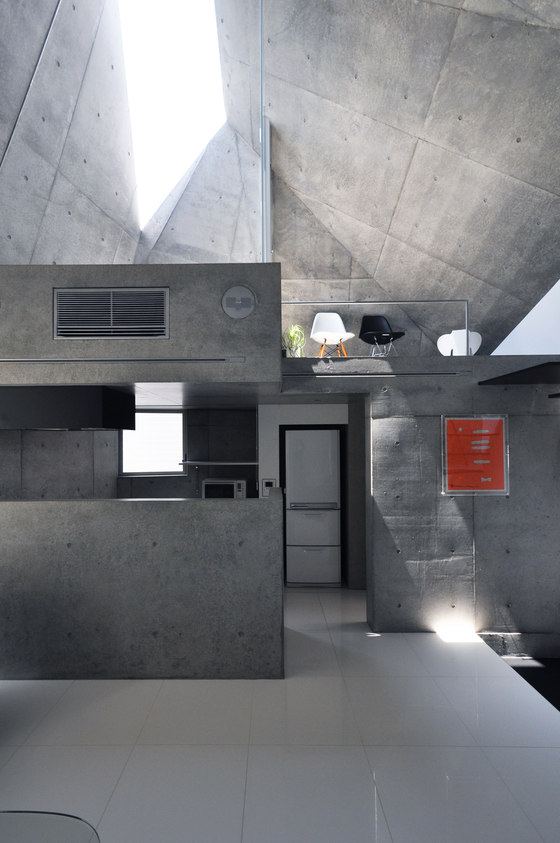
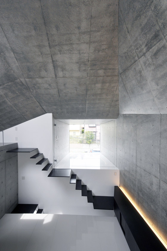
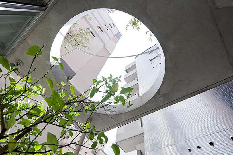
The location is at the bottom of two plateaus on a soft foundation. Therefore, stakes were necessary to support a reinforced concrete structure. In order to reduce costs, contacting area to the ground was minimized and the number of stakes was reduced. Accordingly, the upper structure was cantilevered. Then, the walls in varying volumes and the roof slab were made into three-dimensional continuous slanted surface and the stress transmission was rationalized, which became a characteristic form.
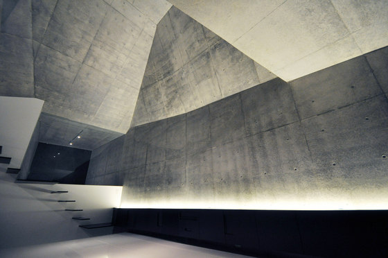
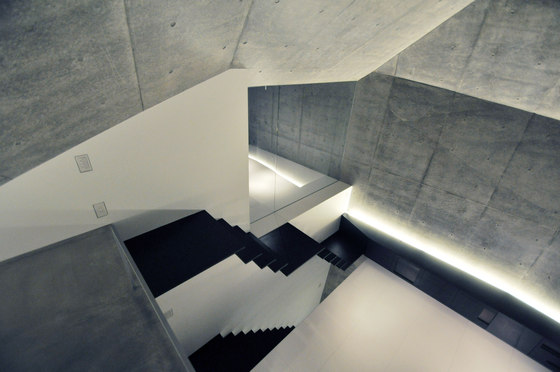
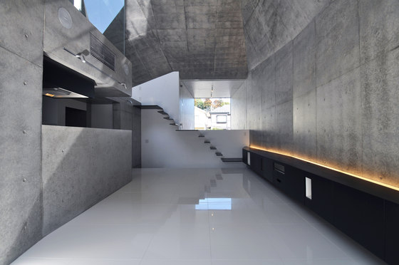
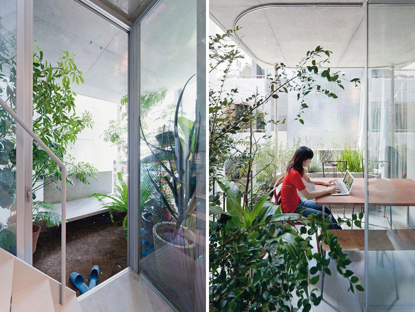
Living/dining room on the second floor has a large open composition towards the green way so as to take in the trees planted on the south side of the site to the interior space. The haircutting space was raised for 1.2 meters from the second floor, so that people will look at the south side green way and the upper side green way and the upper side of the parking on the north side. It also controls the eyesight from the surroundings. The interior space was given a modulated proportion and scale that respond to each space’s activities.
The monocoque form made of concrete was inflated and squeezed, following the necessary spatial volume at the living room, cutting space and the wet area. The stiff structure enabled a sash-less detail of glass and the exterior wall aligned in the same surface and realizes the exterior that emphasizes various facets.
The residence creates many senses of distance by the form that pursued the relationship of spaces and a rationality of the structure. Moreover, by the angles of the multi-surface composition the space is divided, though connected, and creates various sequences that are accompanied by sensual naturel light’s reflection and refraction.
Design team:
fuse-atelier + Musashino Art University/fuse-studio
Project partners:
Main contractor: Shishido Koumuten
Structural Engineers: Ysutaka Konishi
Incase 2013 Spring Camo Collection
 Incase‘s introduction of its Camo Collection for Spring 2013. Boasting durable twill construction alongside a specially designed custom camouflage pattern, the collection includes the likes of Incase’s DSLR Sling Pack, DSLR Pro Pack, Range Backpack, and Campus Pack, while select pieces also incorporate black and orange accents throughout. The Camo Collection can be purchased online now.
A$AP Rocky for Mr. Porter
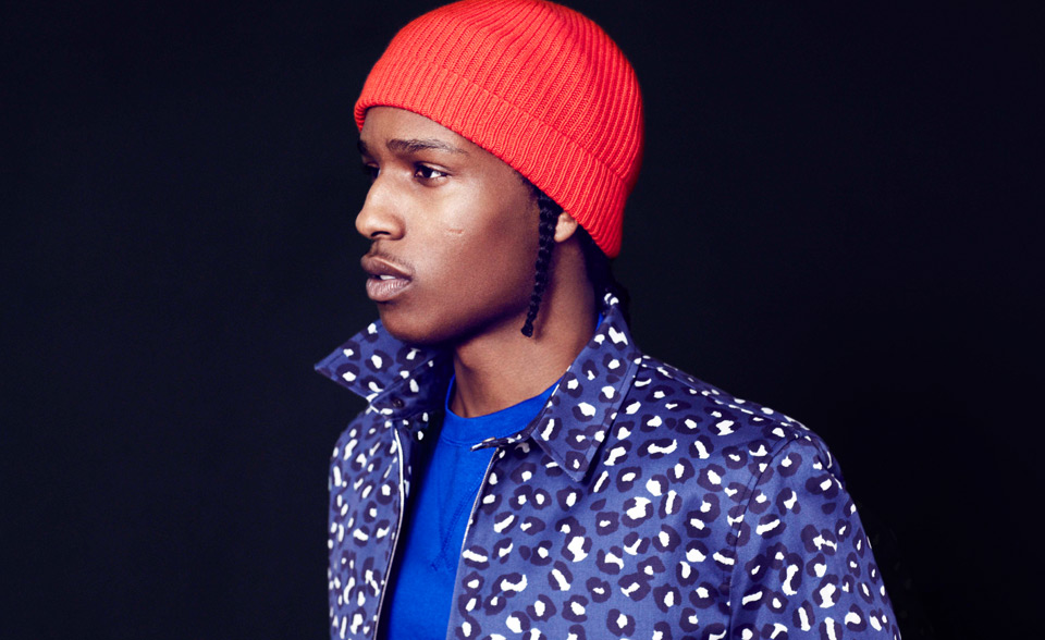
It’s only a short distance from the tough streets of Harlem to the front row of a New York fashion week runway show, but it’s a journey that very few rappers have made. A$AP Rocky, however, managed it even before the recent release of his No.1 debut album, Long.Live.A$AP. And his appearance at last month’s Paris fashion week, dressed in clothes by British designer Shaun Samson, reinforced the impression that he has come a long way from a childhood that inspired the line on his album’s title track, “I thought I’d probably die in prison”.
On meeting A$AP it quickly becomes obvious that if any young rapper is going to transcend hip-hop’s cultural ghetto it’s him, despite the fact that the 24-year-old admitted to dealing drugs in the past. Lots of MCs enjoy enough success to make the leap, but few have the vision to grasp the opportunity. Yet the way A$AP explains it, it sounds deceptively simple: “I realised that the streets were my reality, and I wanted to make another home, so I started doing positive things. Some people have it in them to get out, and some people are content to stay in the hood. You’d be kind of stupid to get stuck in a bad predicament your whole life, but I feel blessed because I know where I came from and everything I’ve been through.”
Because they can’t say that I suck, they can’t say that I’m not handsome, and they can’t say that my lyrics are wack, they say that I’m gay because they don’t have anything on me
That “everything” includes two family tragedies. The first was the death of his older brother, Ricky, “Killed about 10 years ago”, according to A$AP. “He was a gang-banger, a Blood [member], and he got killed. I wanted to be like him but when he died on the streets I realised that the streets are not the place I wanted to make home,” he remembers. His older brother didn’t just inspire A$AP to escape the block; he gave him the tools to do so by introducing him to rap music. “My brother was a hip-hop fan, and when I was eight he made me rap for the first time – he was beating on the table to make a beat, I started rapping and he encouraged me to keep doing it.”
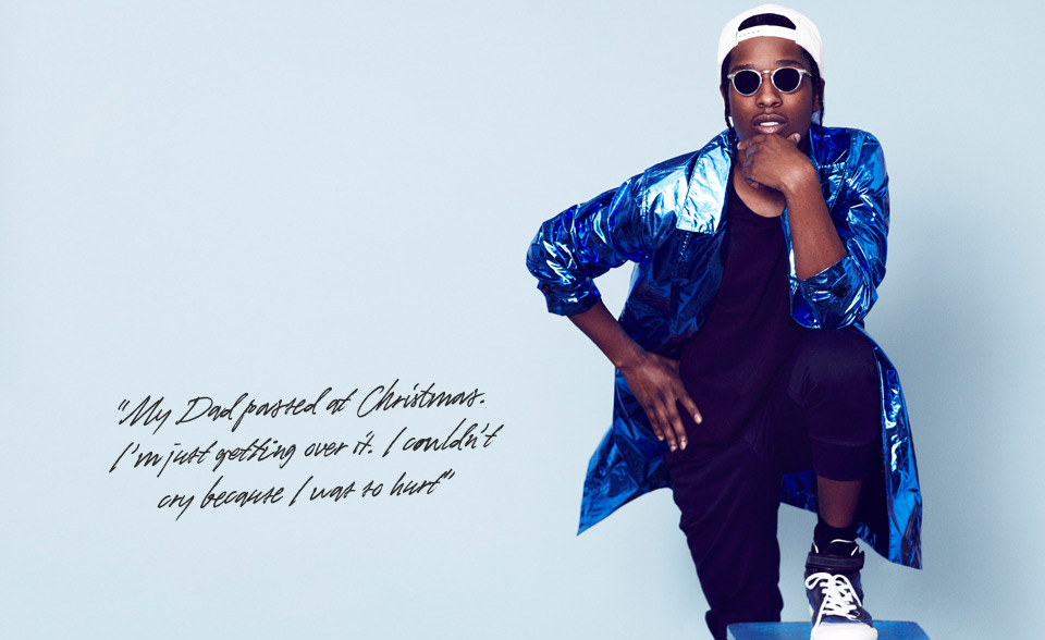
Much more recently A$AP also lost his father. “My Dad passed at Christmas,” he explains. “I’m just getting over it. I stayed in the house but I couldn’t cry because I was so hurt. He caught pneumonia on a Friday and died on the Sunday, so it was unexpected, but at least he got to see me do this.” His father was also a rap fan: A$AP’s real name is Mr Rakim Mayers, his Christian name inspired by the 1980s rapper behind Paid in Full and “Eric B. is President”.
Central to A$AP’s success is that his take on rap music is Pan-American. Since it first emerged from the parks of New York’s Bronx, hip-hop has always been rabidly territorial. In the 1980s rappers from the five New York boroughs battled over the culture’s geographical origins, while in the 1990s a rivalry between the US east and west coasts cost the lives of rappers Biggie Smalls and Mr Tupac Shakur. A$AP is different, in that his taste, and his sound, cover the gamut of hip-hop culture. When asked about his influences he mentions Southern rappers Geto Boys and Three 6 Mafia, Midwesterners Bone Thugs-N-Harmony, LA’s Dr Dre, and New York’s Ruff Ryders label. No wonder his breakthrough song, “Purple Swag”, with its woozy production, is so hard to geographically pin down. This could be the result of the way that the internet enables people to abandon tribal loyalties and take a pick-and-mix approach to music, or, as The New York Times recently suggested in a story about A$AP’s friend and collaborator, A$AP Yams, the result of a rather considered approach to marketing. I’d tend towards the former given A$AP Rocky’s ease with the once-heretical idea of a New York rapper enjoying music from the west coast and the “Dirty South”. “I don’t know if it was wrong [to enjoy music from all over America],” he says, “but I can say that my brother used to do it, so I adopted it.”
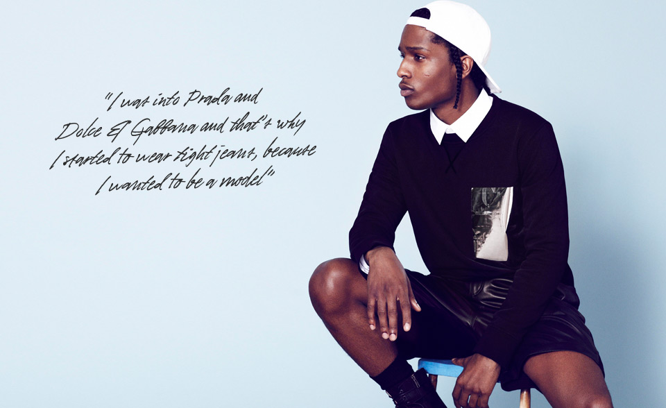
His taste in clothes is also unusual given his profession. On the track “Peso”, which he released in August 2011, A$AP declares that it’s “Raf Simons, Rick Owens, usually what I’m dressed in”. The line immediately suggests a sophisticated taste in style, something he reveals goes back to 2005. “At the age of eight I started getting into fashion, brands such as Tommy Hilfiger, Nautica and Ralph Lauren,” he remembers. “But in 2005 I started wearing John Richmond jeans. I was into Prada and Dolce & Gabbana at the time and that’s why I started to wear tight jeans, because I wanted to be a model. I started to do freelance work for Calvin Klein so I was slim and it just stuck.”
I’m not your average rapper. For us to be thugs and admire high fashion is kind of odd, but people like it
A$AP arrives at the MR PORTER shoot wearing clothes by Jil Sander, Balenciaga and Junya Watanabe, but, again breaking the rap mould, says he has no plans to set up his own fashion brand. “I don’t want to. It would be disrespectful to take my stardom and bully my way into the fashion industry, because I didn’t go to [fashion] school to learn about design, sketching and fabrics. I just enjoy it; I’m a consumer.” Given the macho nature of the hip-hop world I obliquely ask if A$AP’s interest in fashion, and the cut of his jeans, have ever led people to call his masculinity into question. He responds bluntly: “People say I’m gay sometimes, but I have a lot of bitches so why would I care? It doesn’t bother me at all. You know why they say that? Because they can’t say that I suck, they can’t say that I’m not handsome, and they can’t say that my lyrics are wack, so they say that I’m gay because they don’t have anything on me.”
Another way A$AP sets himself apart is by eschewing the bling aesthetic. He admits to owning a nice watch, but that’s it. “I have a Rolex, but no diamonds. Rappers wear diamonds to compensate for a lack of fashion sense. I don’t even have pierced ears – I’m not into that, it’s too much.” No less extraordinary is his taste in cars. “I don’t like new cars, I’m into vintage cars – there’s a Jaguar E-Type in the ‘Goldie’ video.” He believes his taste is part of the appeal of his crew, the A$AP Mob. “I’m not your average rapper. For us to be thugs and admire high fashion is kind of odd, but people like it.”
Photography by Mr Bruno Staub
Styling by Mr Tony Cook, Junior Fashion Editor, MR PORTER
Words by Mr Mansel Fletcher, Features Editor, MR PORTER
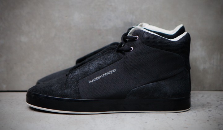
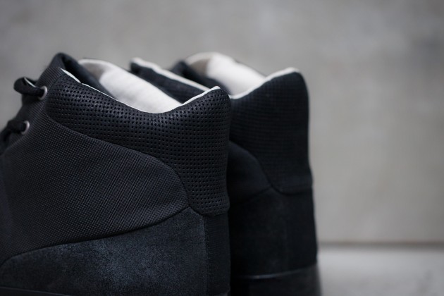
PUMA by Chalayan Hussein Glide II Mid
The PUMA by Chalayan Hussein Spring/Summer 2013 Collection has served up more great work from the British designer and this Glide II Mid certainly stands out. The conceptual design is met with great innovation with a combination of a rough suede and canvas applied to the upper met with a flat glossy black vulcanized sole.
The PUMA by Chalayan Hussein Glide II Mid is available now from Kith NYC.
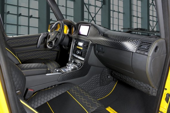
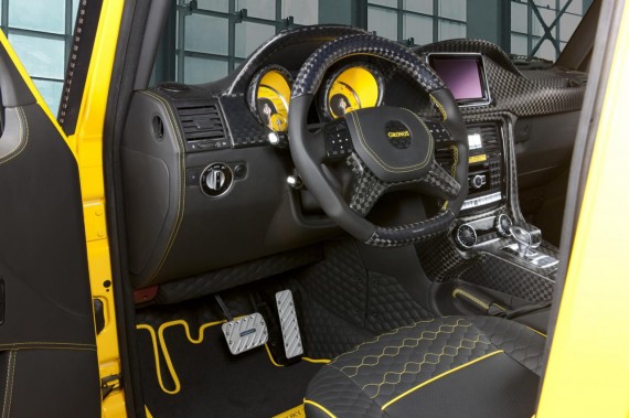
Mercedes-Benz G63/G65 AMG Gronos by Mansory
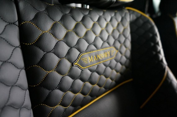
Mansory has used its place at the Geneva Motor Show to display their latest creation for the new Merecdes-Benz G63/G65 AMG SUB. Dubbed the Gronos, this package for the German off-roader brings a significant power boost for the AMG’s twin-turbo V8 5.5-liter engine, increasing its output from 544 HP to a jaw-droppoing 840 HP. This increase is supported by a custom exhaust system, a new front spoiler with LED daytime running lights, a new rear spoiler, and a carbon fiber spare wheel cover. In case you didn’t already notice, this MB is also sitting on 23-inch ten-spoke alloys and is coated in a Magic Yellow paint job. Inside, the tweaks are just a sharp, with carbon fiber, wood, and leather coating the blacked-out interior with matching yellow contrasting stitching joining an entirely re-designed center console and dashboard. View the results of the entire transformation after the jump and head to Mansory’s site in the coming months to learn more about this latest kit from Mansory.
Facebook Shows Off New Home Page Design
The New York Times article by SOMINI SENGUPTA –
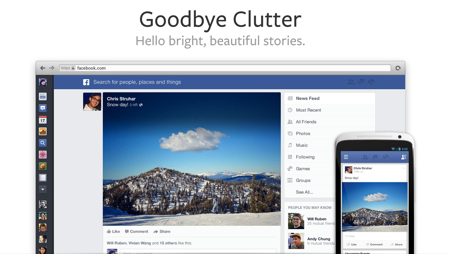
MENLO PARK, Calif. — Hoping to tame the blizzard of information that has turned off many users and discouraged some advertisers,Facebook on Thursday unveiled a major makeover of the home page that greets users when they log into the site.
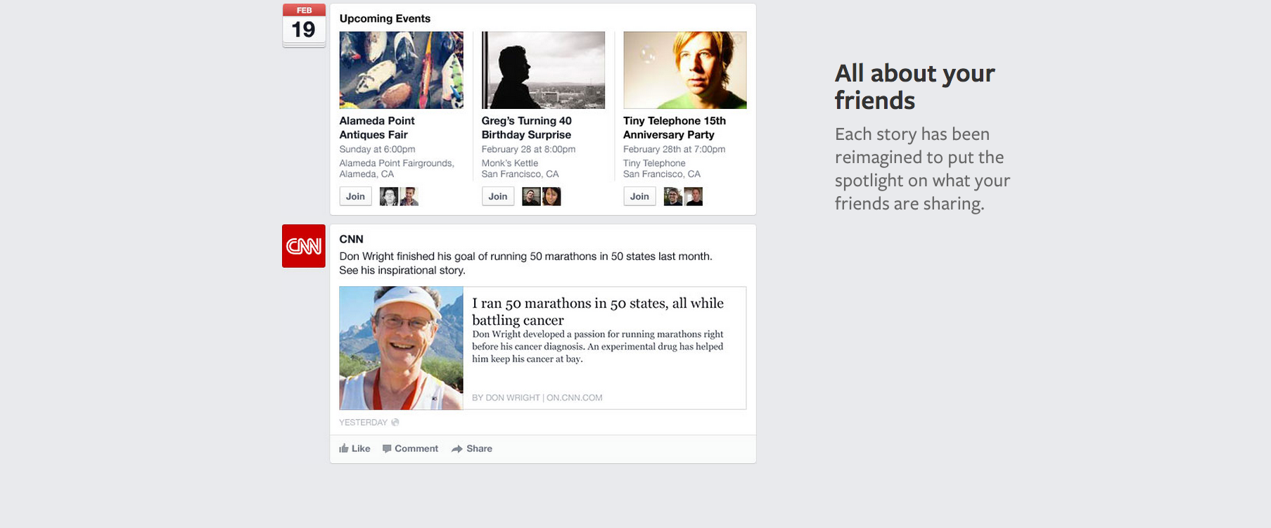
The new design of the Facebook News Feed presents bigger photos and links, including for advertisements, and lets users see specialized streams focused on topics like music and posts by close friends.
The changes are designed to address the company’s two most vital challenges: how to hold on to users at a time of competing, specialized social networks and how to draw more advertising dollars to please Wall Street.
Mark Zuckerberg, the company’s co-founder and chief executive, said at a news conference that he wanted Facebook to be “the best personalized newspaper in the world.” And like a newspaper editor, he wants the “front page” of Facebook to be more engaging — in particular on the smaller screens of mobile devices.
The topic-specific News Feeds could well persuade users to spend more time scrolling through various streams of content. And the redesign will offer bigger real estate for advertisers, including more opportunities for brands to feature bigger pictures, which marketers say are more persuasive than words.
Facebook’s proprietary algorithms, which try to guess what every user will want to see, will continue to filter the items that show up on each person’s main News Feed. And users will be able to drill down into specific topics they are interested in, akin to the sections of a newspaper.
For instance, they can switch over to specialized feeds that are focused on just the music they are interested in, or they can scroll through a feed that consists of posts from the pages of products and people they follow — a bit like Twitter. If they want to see everything that their friends have posted, they can choose to do that, too; those posts will rush down in chronological order, without any filtering by Facebook’s robots.
Facebook introduced the new design to some users of the Web version of its service on Thursday, and will extend it to all Web users and to mobile apps in coming weeks.
It’s unclear how users will react to the changes; in the past, major design changes have often been greeted by complaints, at least initially.
Investors seemed to welcome the new look. Shares of Facebook rose 4.1 percent on Tuesday, to $28.58. But the company’s stock price remains substantially lower than its $38 initial public offering price last May.
Facebook is clearly hoping the new format will encourage users to stay longer on the site. At the news conference to announce the changes, officials offered examples of content they hoped would be compelling: photos of a cousin’s babies on one area of the page, Justin Timberlake concert news on another, a list of stories your friends liked on National Public Radio on still another.
“The best personalized newspaper should have a broad diversity of content,” Mr. Zuckerberg said. “The most important stuff is going to be on the front page,” he went on. “Then people have a chance to dig in.”
The announcement met with swift praise from the advertising industry. In addition to bigger ad formats, the redesign’s specialized content streams could keep users glued to the site longer, marketers said.
“This will result in more time spent over all on the Facebook News Feed — and of course, increase engagement with content and ads,” said Hussein Fazal, chief executive of AdParlor, which buys advertisements on Facebook on behalf of several brands.
Facebook executives suggested that there would be no immediate changes to the number of advertisements that appear on the News Feed.
Julie Zhou, the company’s design chief, said only that ads would be more visual. “Everything across the board is going to get this richer, more immersive design,” Ms. Zhou said.
The redesign is also a nod to the ubiquity of mobile devices, which a majority of Facebook’s one billion users worldwide use to log into their accounts. Pictures will show up bigger in the News Feed. And there will be larger images of maps and links to articles. In that way, the new look is a nod to other social networks that are seeing viral growth, like Pinterest, which is built around large pictures.
The new News Feed emphasizes the importance of photographs, which are one of Facebook’s most underexploited assets. Mr. Zuckerberg said that half of all News Feed posts are pictures, compared with about a quarter of all posts a year ago. Every day, 350 million pictures are uploaded to Facebook by individual users and brands.
The new design is virtually identical on the desktop and on tablets and cellphones.
Colin Sebastian, an analyst at Robert W. Baird, said that the changes were positive for the company. “We see this as more likely enhancing the longer-term value of Facebook for both users and advertisers rather than adding materially to financial performance in the very near term,” he said.
Users weighed in on Twitter.
“Not sure if @facebook is merchandising our attention or Zuckerberg cares about our reading habits,” Daixin Neill-Quan, a self-described Boston University senior, posted after the news.
Others pointed out that Flipboard, a popular app, already offers a personalized newspaper in which users choose the topics and publications they are interested in.
Siva Vaidhyanathan, chairman of the media studies department at the University of Virginia, said the redesign could help educate users as to just how much Facebook’s algorithms filter what they see on what they think of as their social network.
“Users will at least be under less of an illusion that what’s happening on Facebook is merely a function of what their friends are doing,” he said. “Facebook is the puppet master of our social network.”
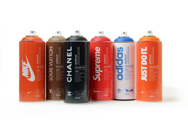
Montana Spray Paint concept by Antonio Brasko
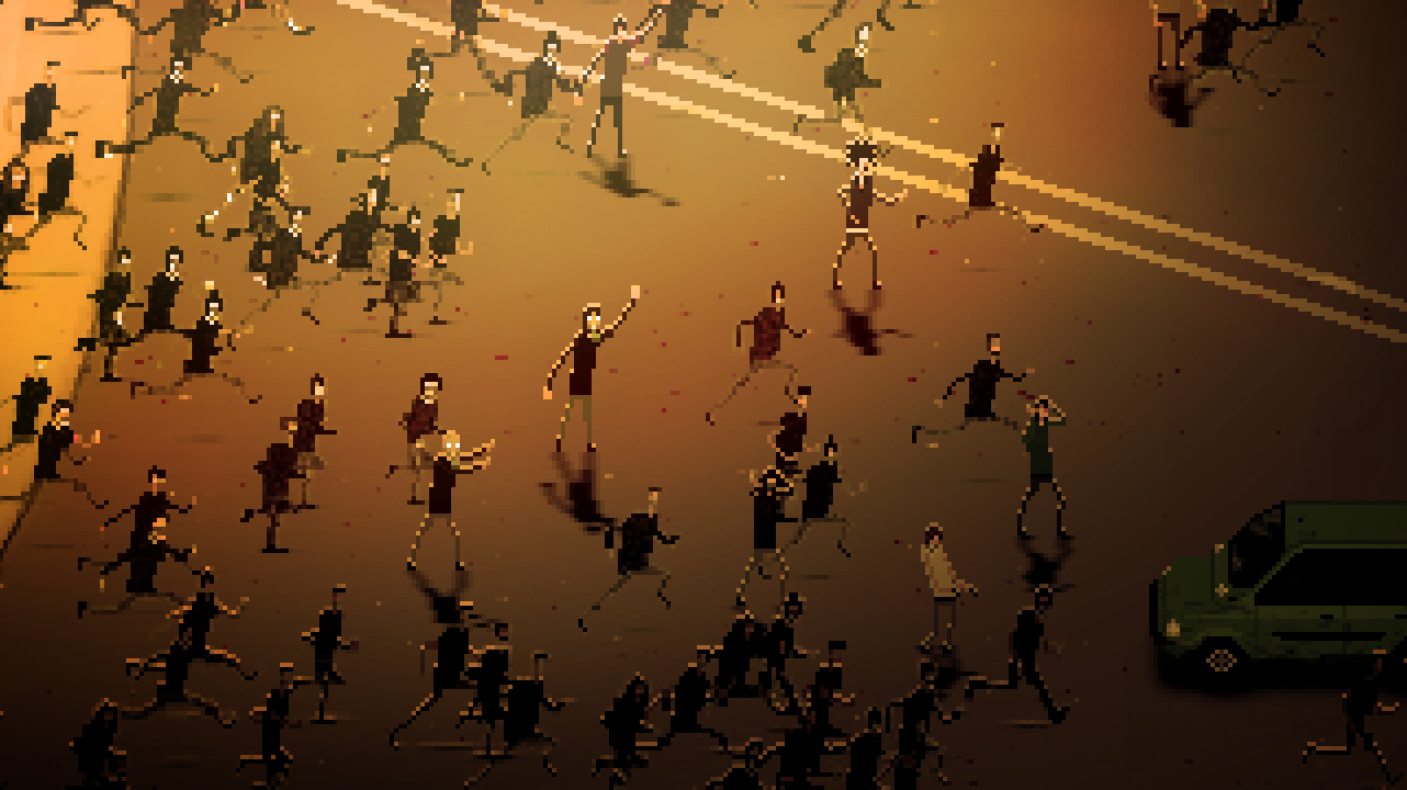
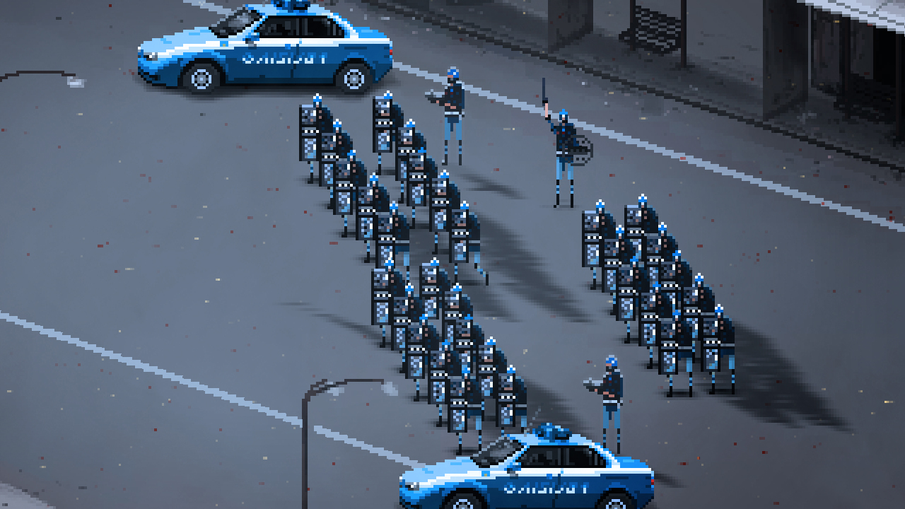
RIOT Video Game Takes Inspiration from Clashes Across the Globe
A Riot simulator for PC, Mac, iOS, Android and OUYA seeking funding on IndieGoGo.
Behind Riot
As the economical crisis advances, the discontent of an entire population cannot help but outburst in Riots, where the sounds of many voices get heard at once. The Director Leonard Menchiari has been experiencing this form of protest in person, and the game “Riot” was born as a way to express it and to tell the stories of these fights. What is that triggers such a strife? What does a cop feel during the conflict? In “Riot”, the player will experience both sides of a fight in which there is no such thing as “victory” or “defeat”.
About the team
The funding for the game will enable the developers to travel, document and experience live riots going on in Italy, Greece, Egypt and possibly many other places around the world. Only comments and reports from the people joining the conflicts will be taken into consideration, attempting to depict both sides of the fight without bias, only objectivity and facts. Leonard Mechiari, previously an Editor/Cinematographer at Valve, is joined by game designer Mattia Traverso, programmer Ugur Ister, composer Simon Michel, sound designer Eric Wegener, and sound designer Rolando Nadal on his team.
On the funding
In addition to the rent and living expenses of the people involved, the costs for the research phase and the eventual contribution of other composers, software licenses are required to release the game on PC, Mac, iOS, Android and OUYA. Living in a country drowning in debt and corruption, it is practically impossible for Team “Riot” to find way to fund the project in Italy and we are therefore asking for your help. We need you to spread the voice on an important issue through the medium of videogames. Stop listening to the lies of the media, shut down the television and get yourself in the line, to fight for your freedom of speech.
Facebook Page: https://www.facebook.com/riotgame.org
Twitter Page: https://twitter.com/LMenchiari
Official Website: http://www.riotgame.org
Presskit: http://www.stimunation.com/projects/R…
Contact email: leonard.menchiari@gmail.com ; contact@mattiatraverso.com
The Liquid Light Series by Kristine Five Melvær
The Liquid Light series is part of the Still Life project, where Melvær reinterprets traditional still life motives.
Liquid Light is a birch wood plate holding a glass carafe and a brass socket for a candle. When the carafe is filled with liquid and the light is lit, the carafe works as a lens that amplifies the light. The light is colored by the liquid and gives a glowing light to the dinner tables in the Scandinavian winter evenings. The object is inspired by the Cobbler’s Lamp from the 17th Century.
Liquid Light is exhibited at the Food Work Exhibition – an independent project initiated by Torbjørn Anderssen and Espen Voll, two of the founders of Norway Says. 21 designs by 8 Norwegian designers are to be shown at Tokyo Midtown Hall during Designtide Tokyo 2012 from October 31st to November 4th.
As the title indicates, the topic of the project is food: storage, preparation, presentation, and eating. These objects spring out of simple and ordinary, yet essential and vital, actions that tie people together across cultural differences. The objects are designed for everyday situations in Norway – they are Norwegian. However, we have been inspired by Japanese culture, or rather by our particular understanding of Japanese culture. In other words, we have attempted to make Norwegian objects that could also be relevant to Japanese living. Our goal is to draw inspiration and knowledge from how our work is experienced in Tokyo.
Materials: Birch wood, brass socket, glass.
Photos: Erik Five Gunnerud
The 20+ Richest Billionaires in Fashion
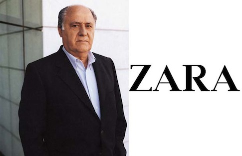
Forbes releases its annual billionaires list. This years list features 20+ names in fashion including Zara titan Amancio Ortega, who came in at number three between Bill Gates and Warren Buffett with a net worth of $57 billion. LVMH’s Bernard Arnault is a few notches below at number 10 with a net worth of $29 billion, while L’Oreal heiress Liliane Bettencourt came in at number nine with $30 billion, making her the world’s richest woman.
New to the list are Tory Burch with $1 billion, and Domenico Dolce and Stefano Gabbana with $2 billion each. At 46, Burch is America’s second-youngest self-made female billionaire after Spanx founder Sara Blakely.
3. Amancio Ortega, Zara, $57 billion
10. Bernard Arnault, LVMH, $29 billion
12. Stefan Persson, H&M, $28 billion
56. Phil Knight, Nike, $14.4 billion
66. Tadashi Yanai, Fast Retailing, $13.3 billion
78. Miuccia Prada, Prada, $12.4 billion
131. Giorgio Armani, $8.5 billion
145. Alain & Gerard Wertheimer, Chanel, $8 billion
166. Ralph Lauren, $7 billion
248. Isak Andic, Mango, $5 billion
248. Philip & Christina Green, Topshop, $5 billion
276. Jin Sook & Do Won Chang, Forever 21, $4.5 billion
458. Renzo Rosso, Diesel, $3 billion
490. Chip Wilson, Lululemon, $2.9 billion
503. Doris Fisher, Gap, $2.8 billion
704. Nicolas Puech, Hermes, $2.1 billion
736. Carlo Benetton, Gilberto Benetton, Giuliana Benetton, Luciano Benetton, Benetton, $2 billion each
736. Domenico Dolce and Stefano Gabbana, Dolce & Gabbana, $2 billion each
1031. Paolo Bulgari, Bulgari, $1.4 billion
1342. Christopher Burch and Tory Burch, Tory Burch LLC, $1 billion each
1342. Sara Blakely, Spanx, $1 billion


