Category Archives: DESIGN
Google spends $1 billion for new central London HQ
Google is building its new UK headquarters in central London. The search engine giant just purchased a 2.4-acre plot in the King’s Cross Central development in London, where the company plans to builda new, 1 million square foot office, said to range in height from 7 to 11 stories. Google did not disclose an official price for the land, but one source with knowledge of the deal told Reutersthat the company is investing £650 million ($1.04 billion) in the project. By the time construction is completed in 2016, the building is expected to be valued at more than £1 billion ($1.6 billion).
“This is a big investment by Google,” Matt Britin, Google’s VP for Northern and Central Europe, said in a statement. “We’re committing further to the UK, where computing and the Web were invented. It’s good news for Google, for London and for the UK.”
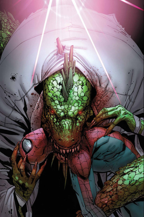
The dark side of comics
The Amazing Spider-Man Vol.1 688
I love this cover art by the artist Giuseppe Camuncoli. Comics are always associated with kids and harmless cartoons. But this is a great example of the dark, graphic side of comic book culture. I would love this as a print on my wall.
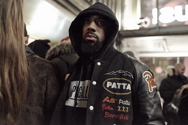
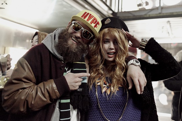
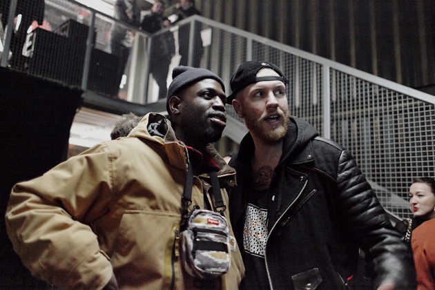
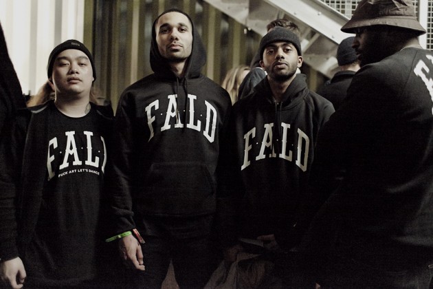
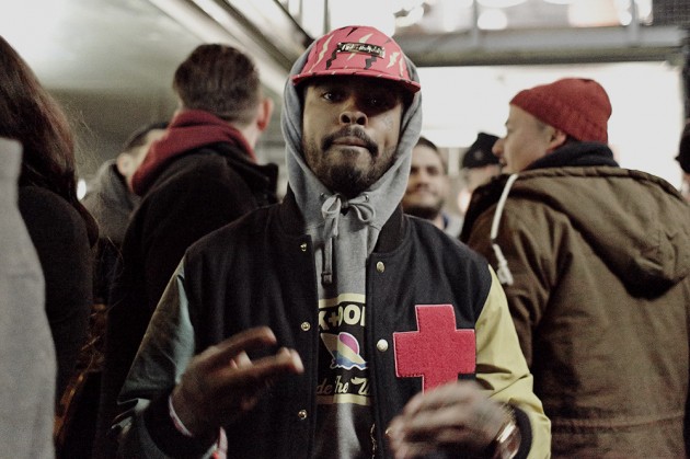
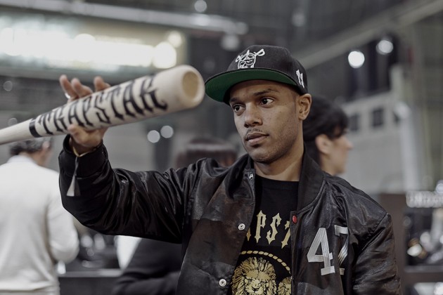
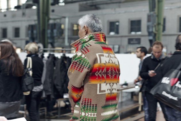
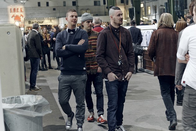
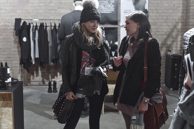
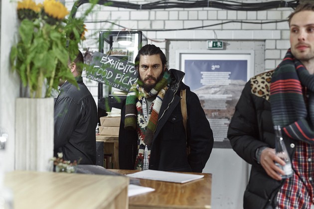
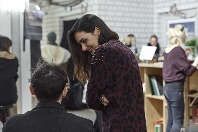
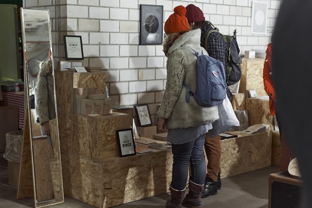
Berlin Fashion Week Fall/Winter 2013 Street Style
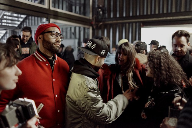
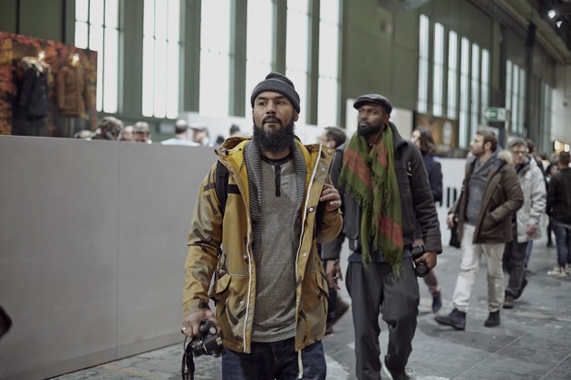
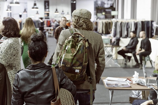
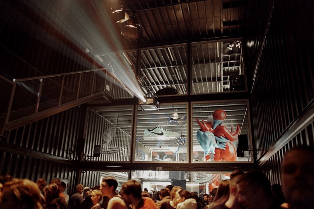
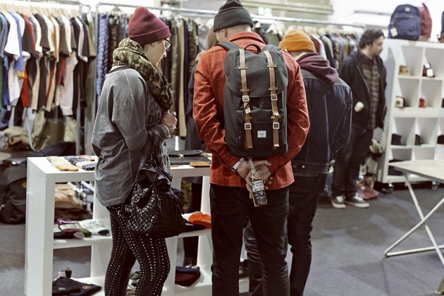
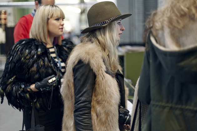
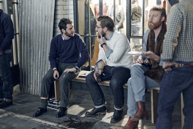
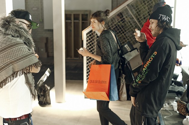
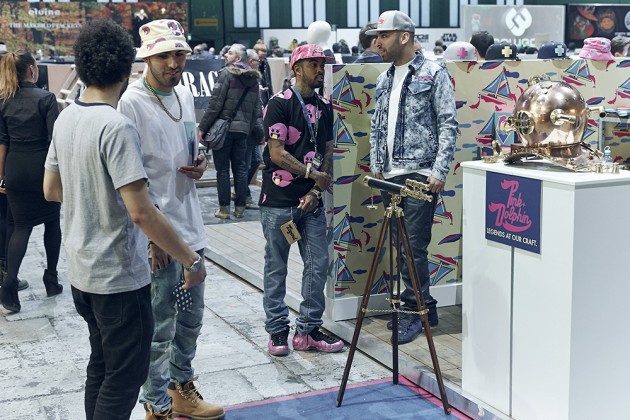
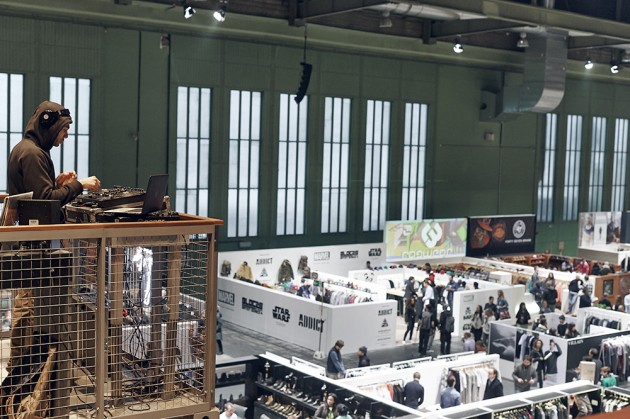
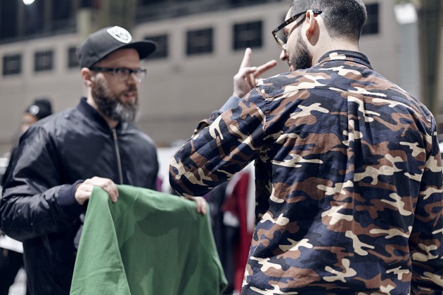
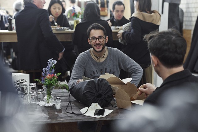
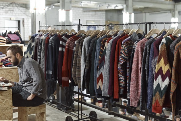
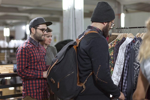
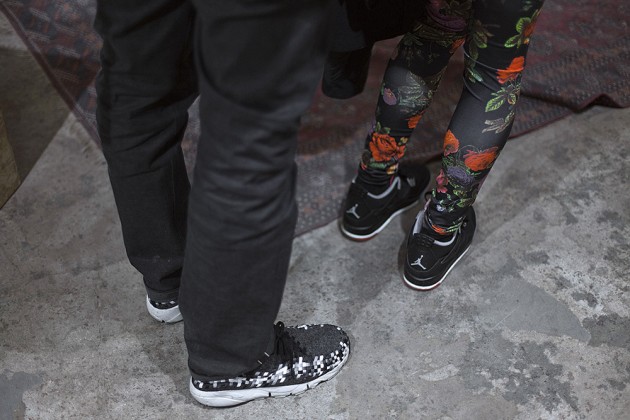
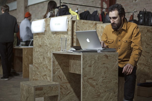
Berlin Fashion Week started last week and as with every year. One of the main attractions is the massive Bread & Butter tradeshow at Berlin Tempelhof Airport. Here’s a snippet of some of the current and coming styles getting around.
Photography: Robert Wunsch, Laura Palm & Marco Schöler
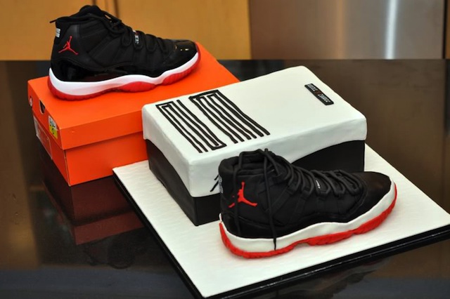
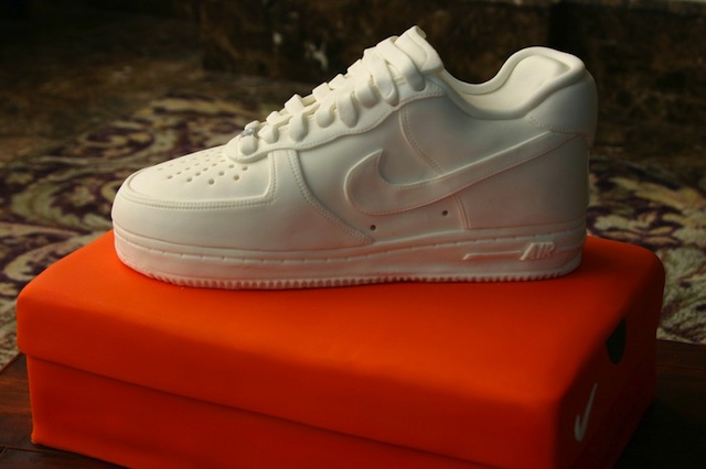
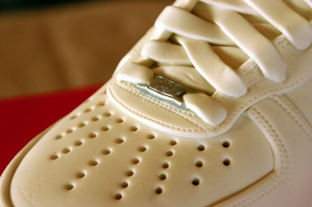
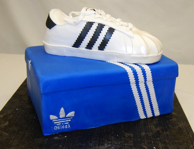
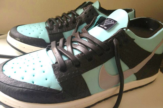
Delicious Kicks: Miscellaneous Sneaker Cakes
As if a fresh pair of kicks isn’t mouthwatering enough. The true sneaker heads celebrate their birthday’s with SNEAKER CAKES. These are impressive.
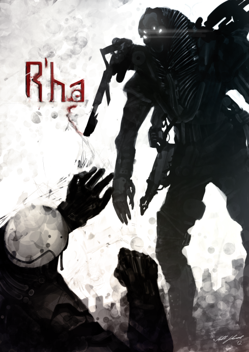
R’HA Short Film by Kaleb Lechowski
Every once in a while a wunderkind director comes along who, with heaps of talent and bootstrapping, creates something with visual effects that seem to be straight out of Hollywood. The Purchase Brothers did it when they created their alien invasion short Half-Life: Escape from City 17 on a measly $500. Then came Fede Alvarez’s Panic Attack, a similarly destructive (and low budget) short in which giant robots eviscerate Montevideo. Now, 22-year-old German film student Kaleb Lechowski has attracted big-league attention with his riveting short R’ha.
The story of an alien race betrayed by its machine army in search of independence, R’ha centers on a single interrogation scene between an uprising computer and its sentient captive. Looking to break free of the limitations of their design–and carry out total elimination of their creators–the machines use some particularly nasty “motivation protocol” to extract key information from their prisoner.
As with many short films, R’ha feels like a snippet of a much larger story. Yet the details of the scene captivate us in their own right, thanks in large part to Lechwoski’s animation. The skin luminosity, musculature, and expressive twitches of the human-snakelike character are exceptional, particularly considering this is a no-budget student film created in seven months. And the film’s intriguing backstory and ambiguous ending beg for future installments.

Given the attention Lechowski attracted even before the film was released (he gained representation from Scott Glassgold and Raymond Brothers at IAM Entertainment based solely on the pre-release trailer) more from theR’ha world seems likely. Lechwoski is currently fleshing out a feature-length story to pitch to studios as a feature. As Glassgold says, “the plan is to use Kaleb’s model of low-cost (or in the case of the short, no-cost) special effects to create a sweeping low-budget science fiction universe.” It’s a plan that seems plausible given that Lechowski’s story world places animated creatures in the “good guy” role conventionally inhabited by costly human actors.
As Lechowski prepares to head to L.A. from Berlin, where he studied Digital Film Design at Mediadesign Hochschule, Co.Create asked him a few questions about the making of R’ha.

Co.Create: Tell us how this project started. What was the inspiration for the film?
Lechowski: We‘ve all seen movies showing highly intelligent aliens but often they are not well prepared for their wars against humanity. Or they seem as if they have not much control over their body with inaccurate movements. They are sticky and wet and naked. I wanted to create an alien race that’s really intelligent. They have a lot of machinery to keep casualties at a minimum. This concept about an alien race is something I have been considering/designing for a while now, and the interrogation sequence seemed like a good entry point for a short film.
The narrative seems like a glimpse of a larger story… did you flesh out more of the backstory in order to create this short film? And why are those computers so damn angry!?
Machines have a much higher contrast than organic beings. They can tolerate very low and very high temperatures. They can always be extended and more power can be added. They are capable of almost anything. Their only limit is their design, how they are created. They feel the aliens are limiting them by design, so they decide to eliminate them. This is their goal. And as machines they don’t need another goal for now, so they hunt them down.

When it comes to creature development, was there any inspiration for your main character?
It was meant to look somewhat beautiful or elegant. He has bright skin, an almost decorated neck that’s shaped like a pharaoh or a king cobra. Yet he is strong. I loved the way Caesar from Rise of the Planet of the Apesexpressed his emotion, so it inspired me a lot, as well.
What animation software did you use to create it?
Most things were done in Maya, like animation, rigging, shading, and rendering (Mental Ray). But I modeled almost everything in Blender because it is a lot faster for me, and I used zBrush to sculpt the alien and paint a lot of objects. Post-production was done in Nuke and After Effects.

Were there any parts of the animation that posed particular challenges?
It was quite an effort to make him receive electric shocks. I recorded myself cramping and tried to animate it that way. I ended up setting keyframes almost every two frames. Another big thing was the slow-motion jump. I recorded myself again to see the timing and, most important, the movement.
What does R’ha mean?
I really like the sound of Ra as an Egyptian god. It’s simple but sounds mighty.
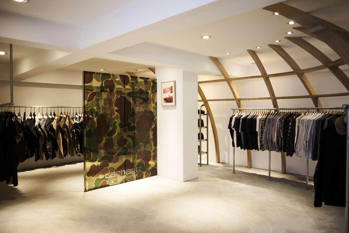
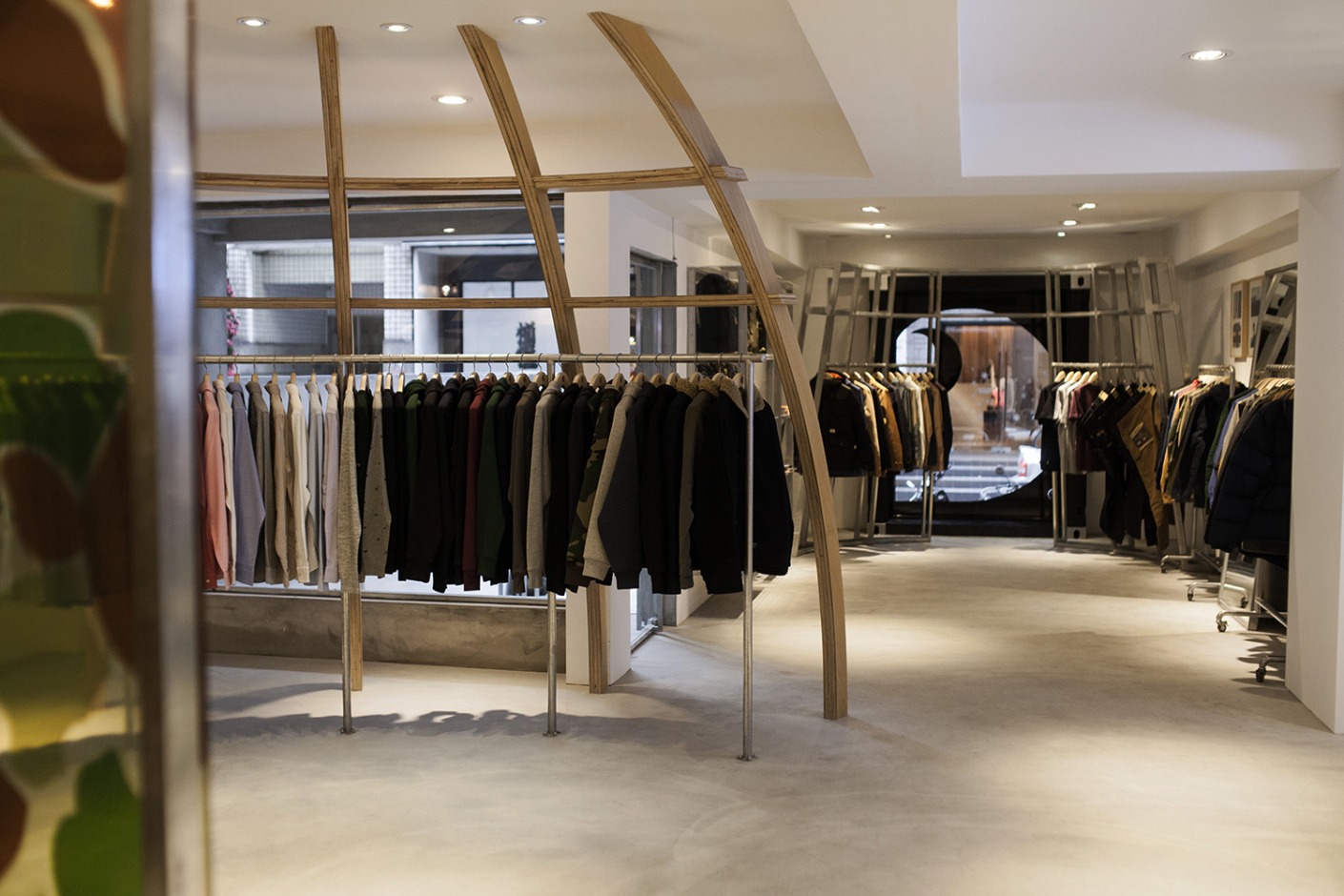
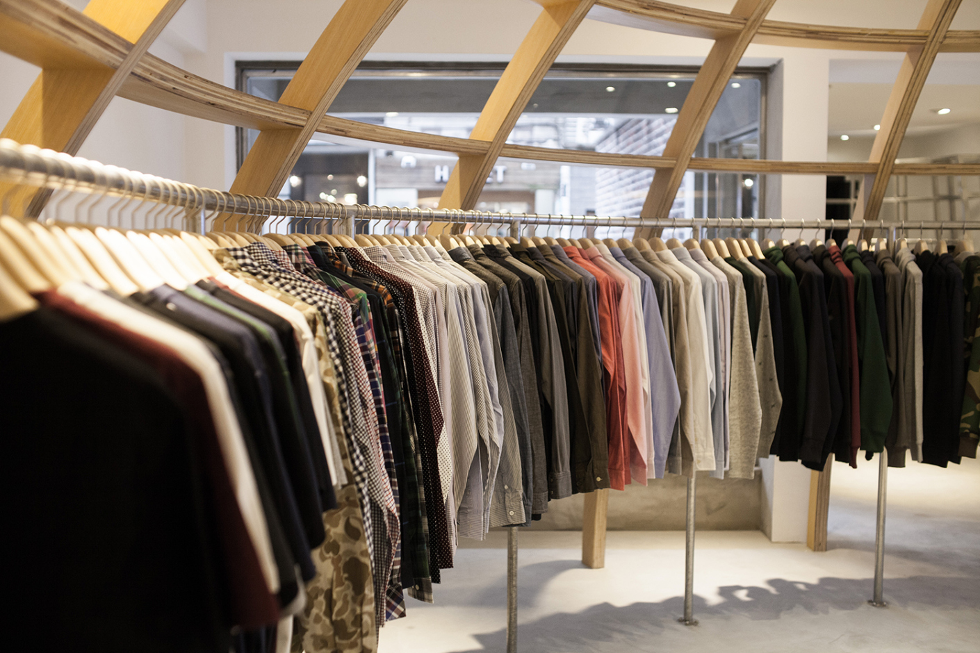
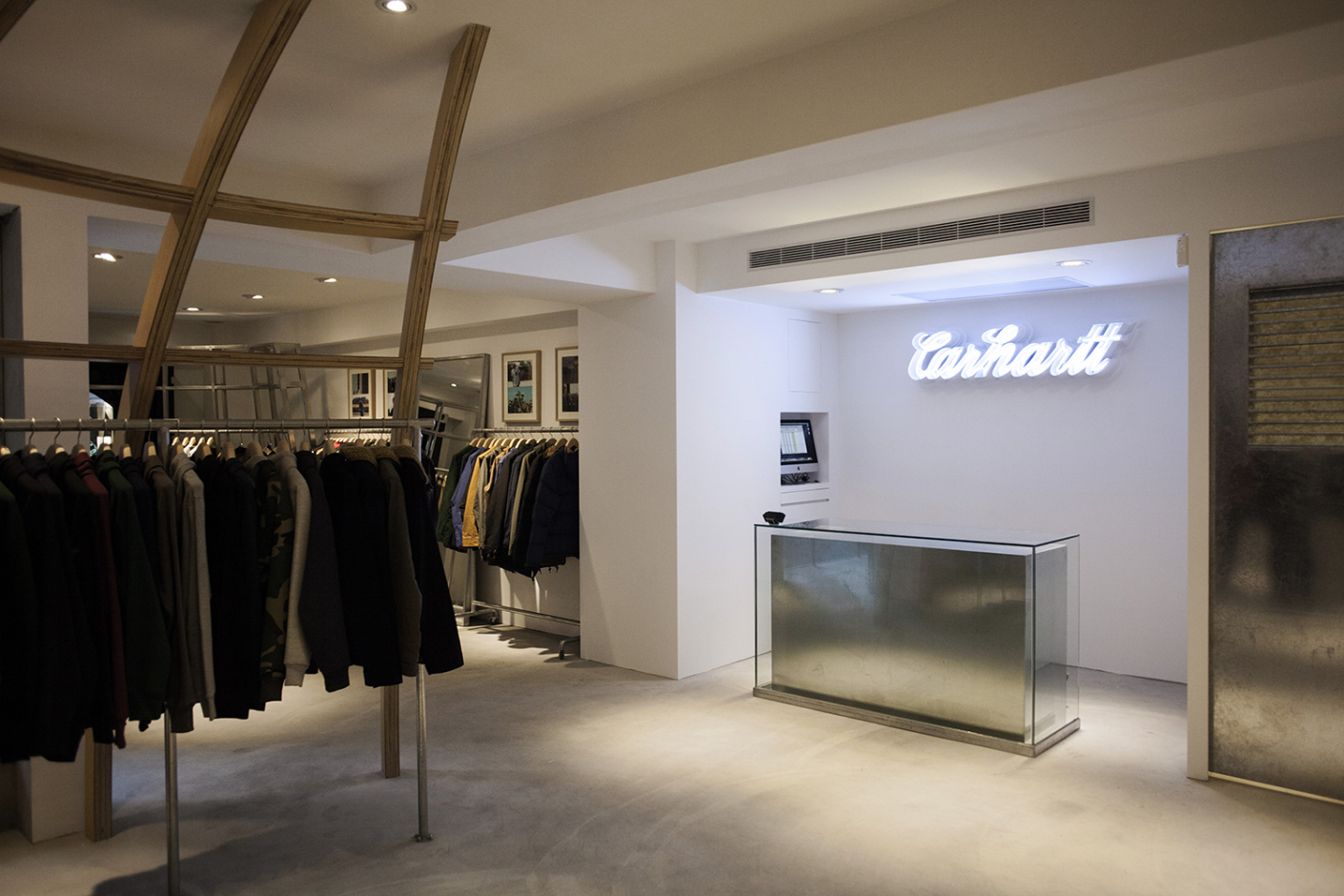
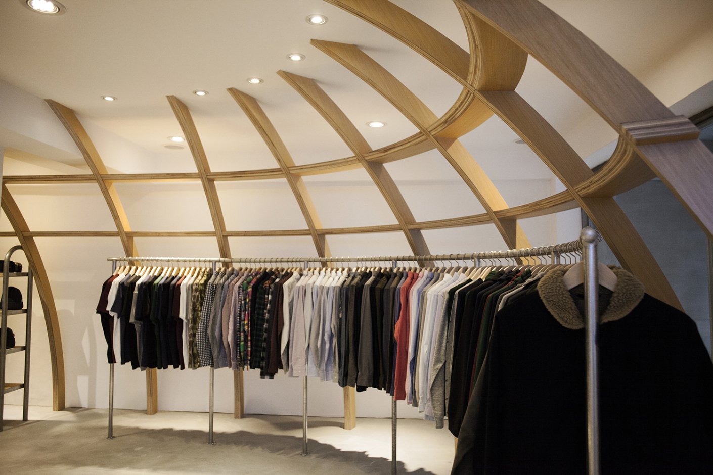
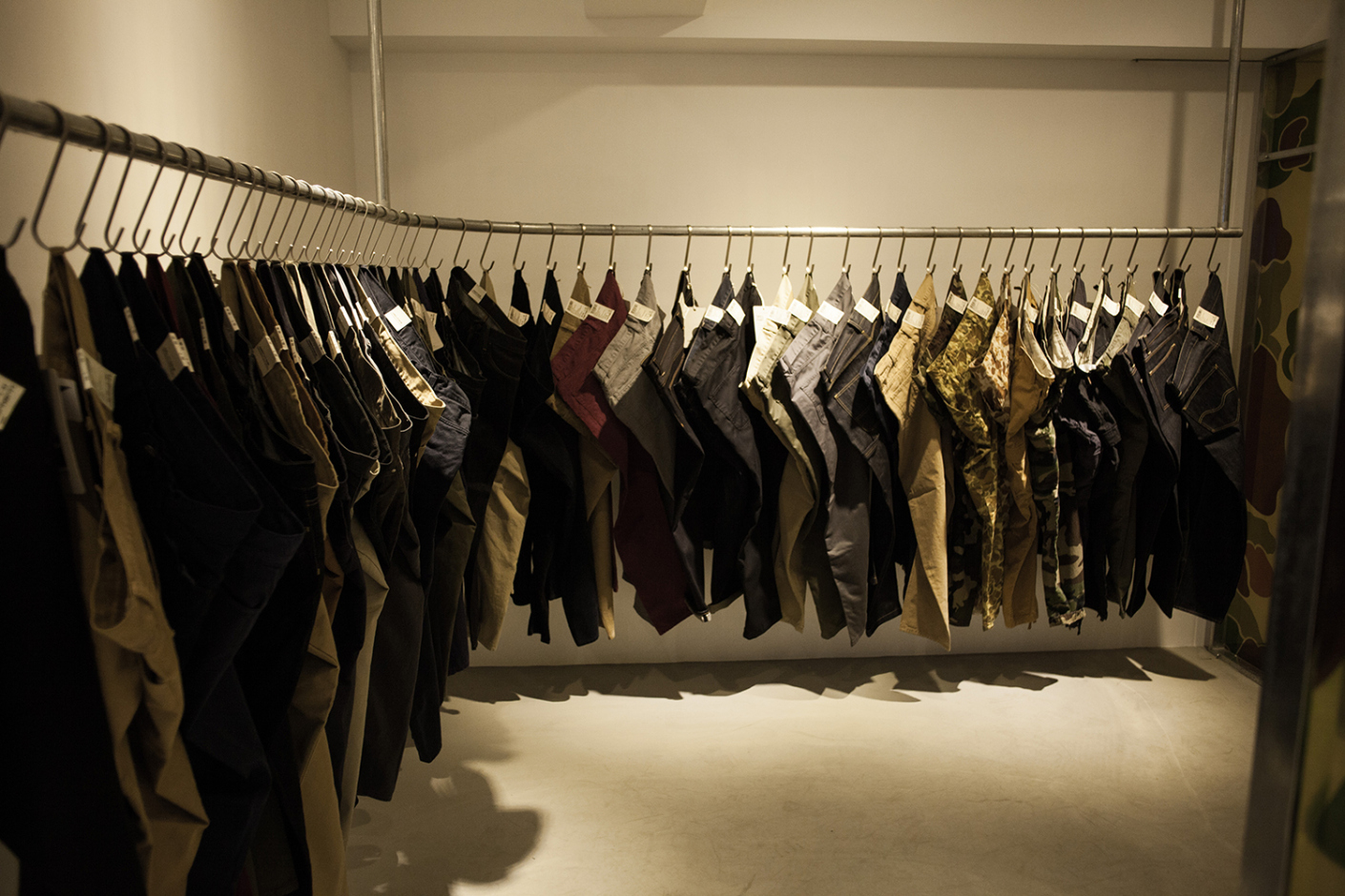
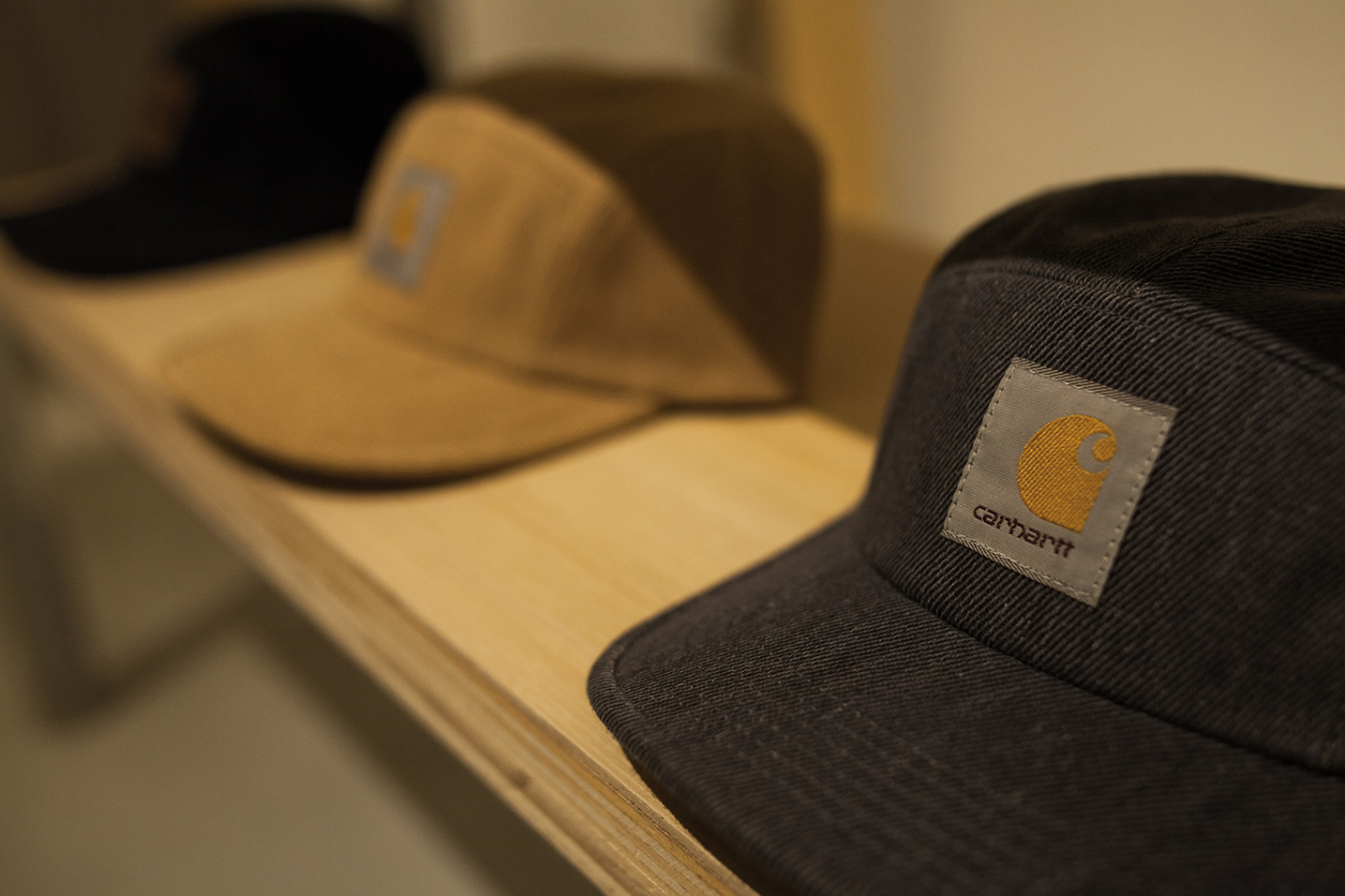
Carhartt WIP Taipei Opening
Carhartt WIP continues with another retail opening, this time in Taipei.
Carhartt WIP Taipei
1F., No.4, Aly. 35, Ln. 181, Sec. 4, Zhongxiao E. Rd., Da’an Dist.,
Taipei City 106,
Taiwan
The Butcher’s Block EP. 11 | Mega of Black Scale (Season 2 Premier)
The Butcher’s Block hits Los Angeles for it’s season 2 premier
Frank The Butcher meets up with Mega, owner of popular street wear brand Black Scale, to discuss the brand’s milestone 5 year anniversary, being influenced by high end fashion and the Black Scale’s respect and relationship with A$AP Rocky.
KRINK x Coach 2013 Spring/Summer Collection
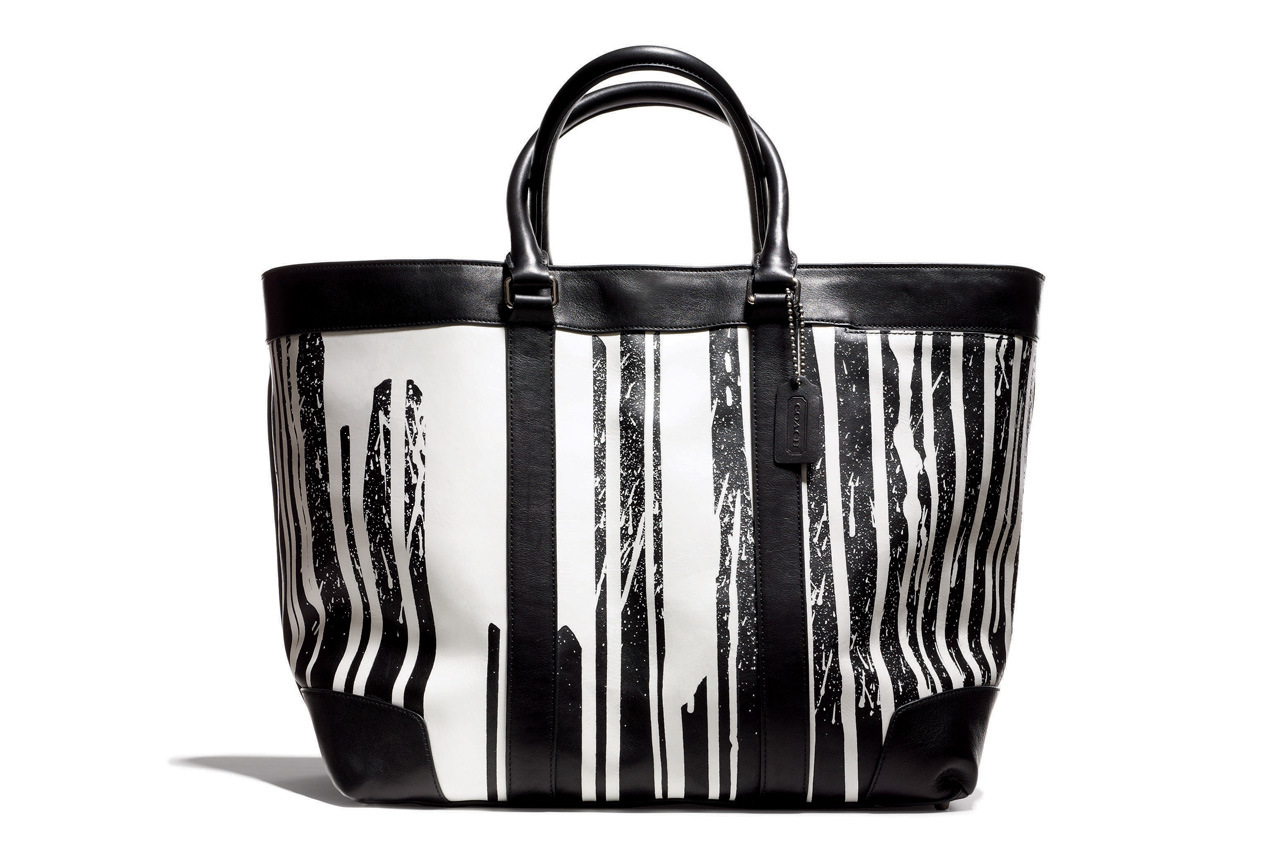
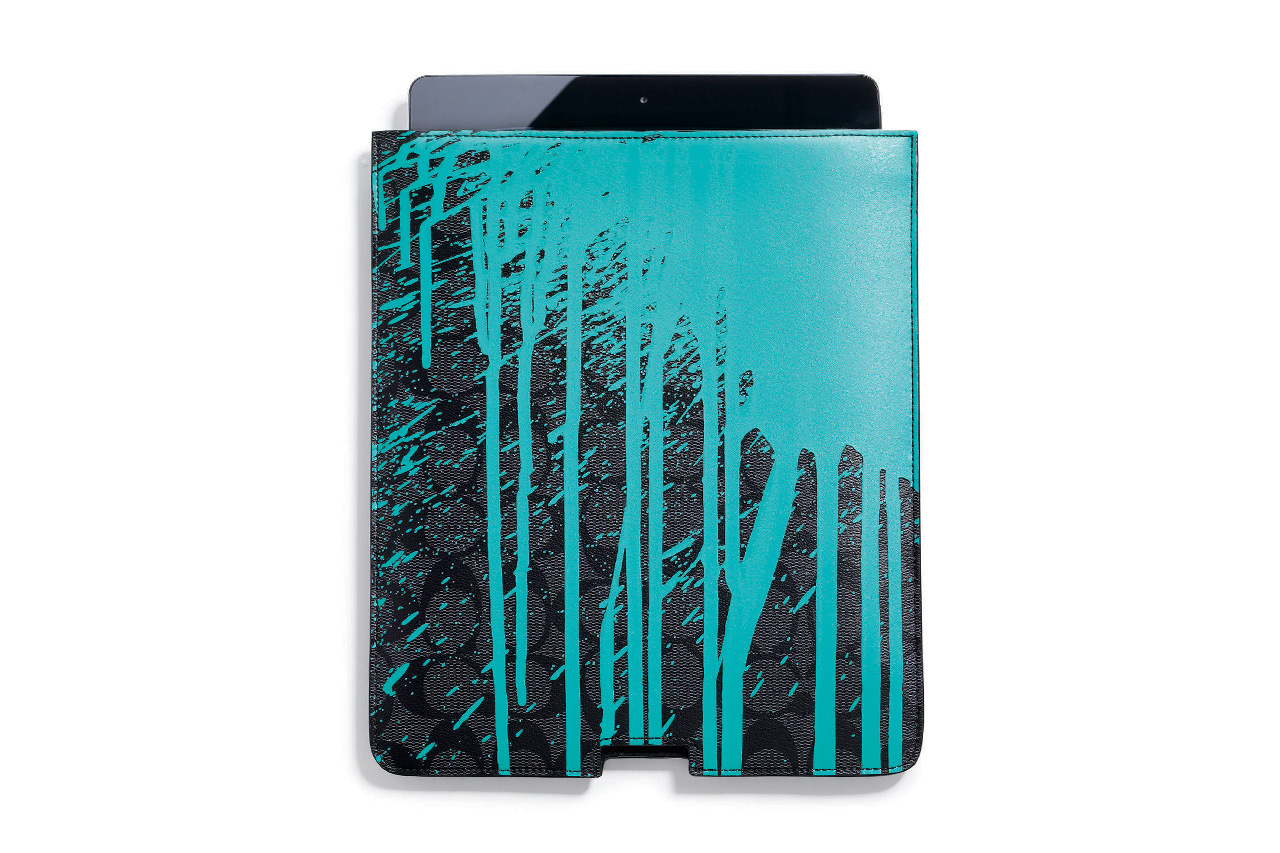
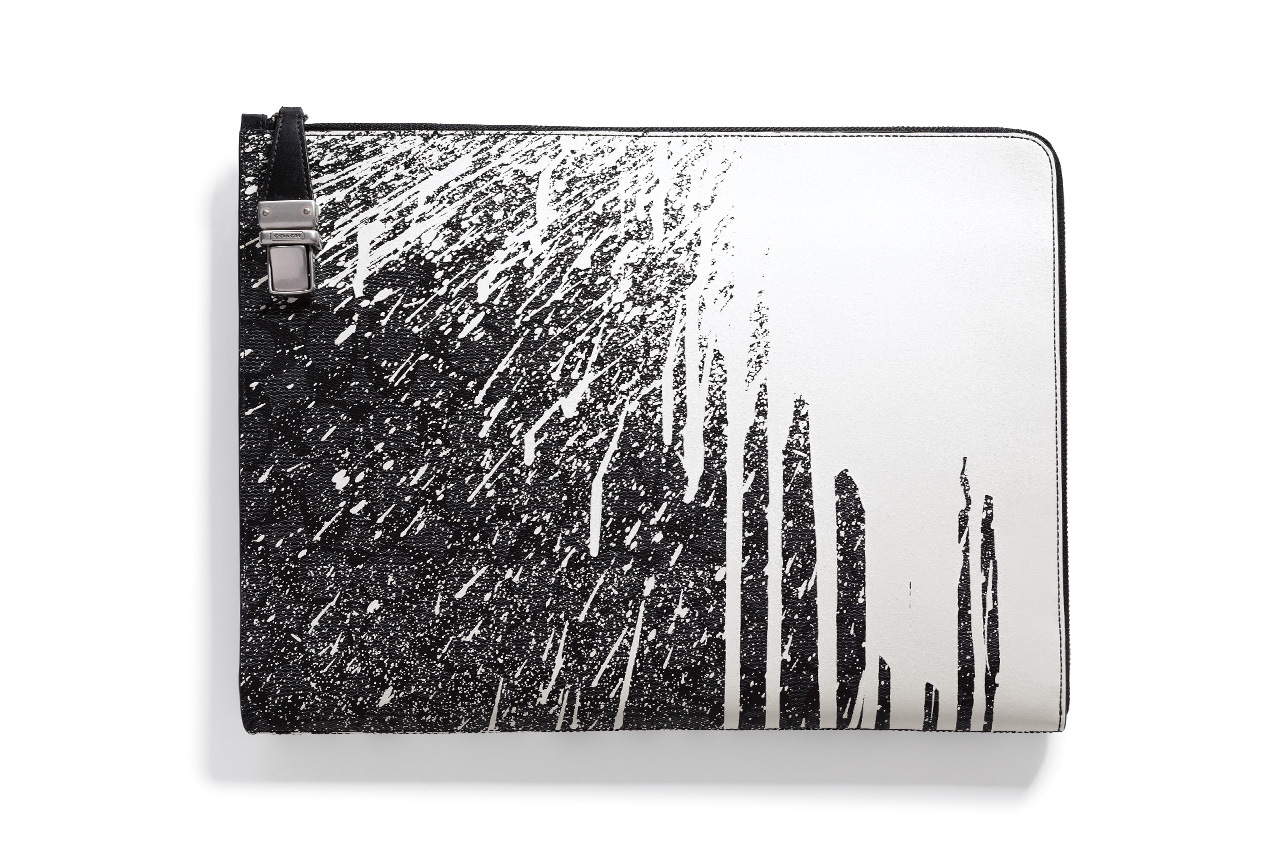
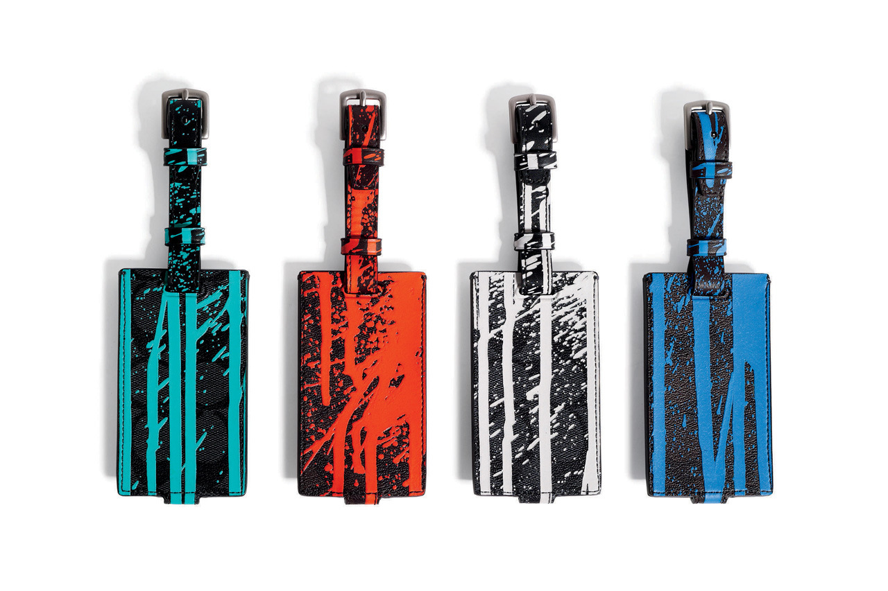
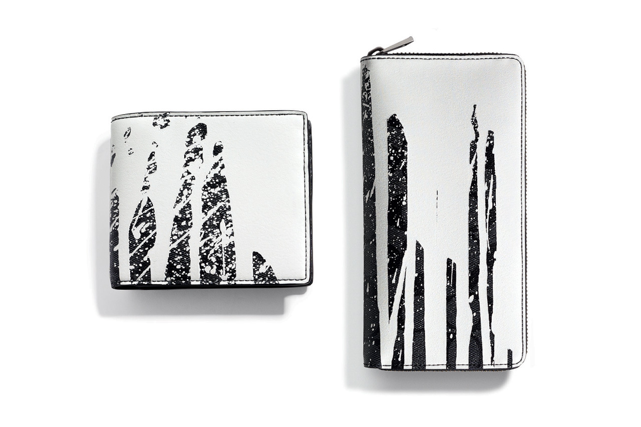
Coach presents its collaborative Spring/Summer collection with Brooklyn-based KRINK. Craig Costello, known popularly as KR and the mastermind behind KRINK, draws from his graffiti, skater and punk influences growing up in 1980s Queens to help produce a series of coated canvas totes and accessories. As another New York-born brand, Coach worked hard with Costello to do its home turf justice, reproducing the controlled chaos of paint drips, splashes and spatters using a 30, count ‘em 30-step silk screening process.
Those hoping to catch some of the limited edition KRINK Collection, which also includes an iPad case, luggage tags, a billfold, an accordion zip wallet, and portfolio, can do so at select Coach outlets worldwide and online beginning late February and until the end of June.
Black Scale (Silence is Illegal) Lookbook
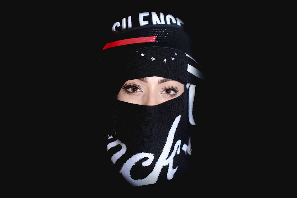
Black Scale presents its “Silence is Illegal” lookbook. Unfortunately little is known of its specifics, however the accompanying images depict two leather and fabric caps adorned with the words “SILENCE” and “ILLEGAL, as well as what seems to be a scarf wrapped around the models faces. Be sure to check back soon as additional details will likely come to light very soon.
Optical Glass House by Hiroshi Nakamura & NAP // Hiroshima, Japan.
Project description
This house is sited among tall buildings in downtown Hiroshima, overlooking a street with many passing cars and trams. To obtain privacy and tranquility in these surroundings, we placed a garden and optical glass façade on the street side of the house. The garden is visible from all rooms, and the serene soundless scenery of the passing cars and trams imparts richness to life in the house. Sunlight from the east, refracting through the glass, creates beautiful light patterns. Rain striking the water-basin skylight manifests water patterns on the entrance floor. Filtered light through the garden trees flickers on the living room floor, and a super lightweight curtain of sputter-coated metal dances in the wind. Although located downtown in a city, the house enables residents to enjoy the changing light and city moods, as the day passes, and live in awareness of the changing seasons.
Optical Glass Façade
A façade of some 6,000 pure-glass blocks (50mm x 235mm x 50mm) was employed. The pure-glass blocks, with their large mass-per-unit area, effectively shut out sound and enable the creation of an open, clearly articulated garden that admits the city scenery. To realize such a façade, glass casting was employed to produce glass of extremely high transparency from borosilicate, the raw material for optical glass. The casting process was exceedingly difficult, for it required both slow cooling to remove residual stress from within the glass, and high dimensional accuracy. Even then, however, the glass retained micro-level surface asperities, but we actively welcomed this effect, for it would produce unexpected optical illusions in the interior space.
Waterfall
So large was the 8.6m x 8.6m façade, it could not stand independently if constructed by laying rows of glass blocks a mere 50mm deep. We therefore punctured the glass blocks with holes and strung them on 75 stainless steel bolts suspended from the beam above the façade. Such a structure would be vulnerable to lateral stress, however, so along with the glass blocks, we also strung on stainless steel flat bars (40mm x 4mm) at 10 centimeter intervals. The flat bar is seated within the 50mm-thick glass block to render it invisible, and thus a uniform 6mm sealing joint between the glass blocks was achieved. The result?—a transparent façade when seen from either the garden or the street. The façade appears like a waterfall flowing downward, scattering light and filling the air with freshness.
Captions
The glass block façade weighs around 13 tons. The supporting beam, if constructed of concrete, would therefore be of massive size. Employing steel frame reinforced concrete, we pre-tensioned the steel beam and gave it an upward camber. Then, after giving it the load of the façade, we cast concrete around the beam and, in this way, minimized its size.
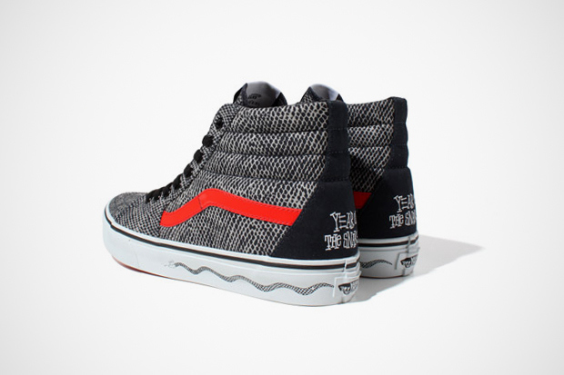
Stussy Japan x Vans Sk8-Hi: Year of the Snake
The “Year of the Snake” Sk8-Hi features a canvas snakeskin upper, accented with a red Jazz Stripe along the side. Additionally, black laces, a gum rubber outsole, white rubber foxing and custom detailing at the heel and tongue complete the shoe. Look for the “Year of the Snake” Sk8-Hi at select Stussy Japan stockists in the coming season.
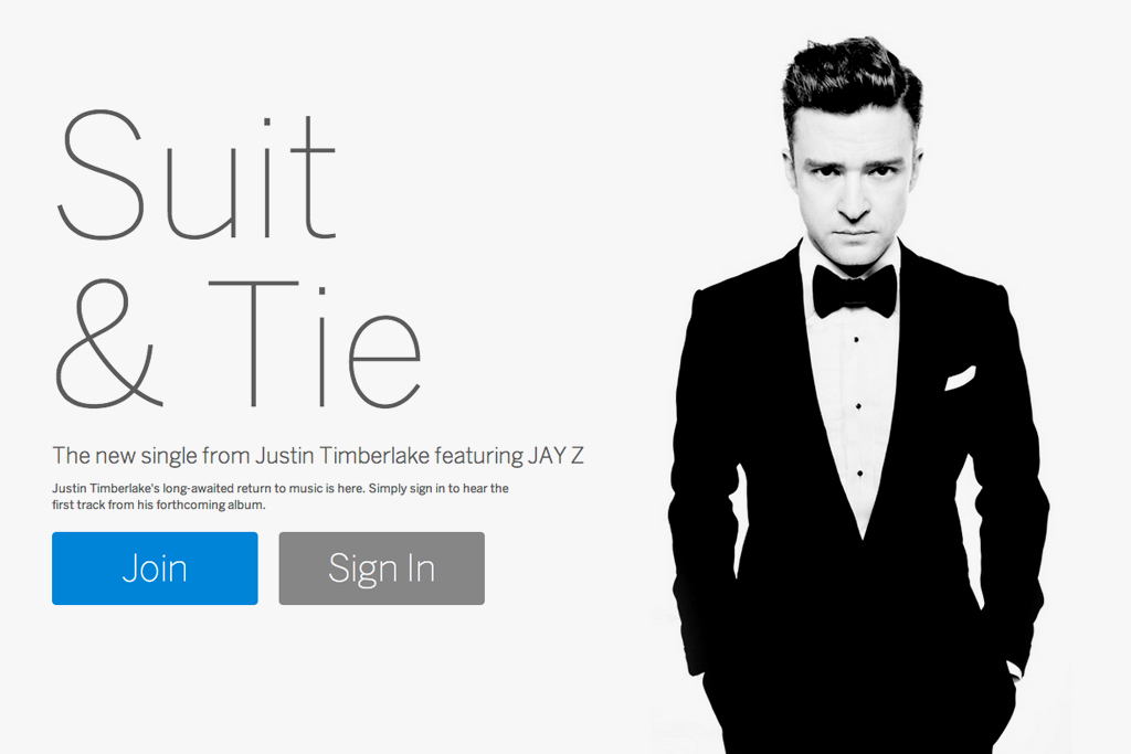
Myspace Unveils Next Generation Redesign
Expertly synced with the release of Justin Timberlake‘s groovy new hit “Suit & Tie,” Myspace has unveiled its newest redesign to the public today. Prior to this, the new version of the website was only available to select beta entrants, but today has been opened for mass registration. Skepticism of the website’s potential success first arose upon the release of a promotional trailer in September 2012, when details of Timberlake and Specific Media’s joint purchase came to the spotlight. Adding a social aspect to music seems to be the key focus in this version of the site. The front page of the new Myspace plays home, at least for now, to access of Timberlake’s newest single, providing added incentive for users to sign up. If there is room for a new reigning social media network, the space will be created by Myspace in the coming months. Only time can tell.
A Closer Look at Street Goth Style

While 2012 brought many trends we’ve since grown tired of, the Year of the Dragon also brought a few that we’re just now starting to really take notice of. Among these is the emerging and most likeley soon-to-be-mainstream street or ghetto goth look propelled to the forefront by rappers like A$AP Rocky. Other rappers and celebrities have incorporated various parts of the look, too, thanks to recent pieces by designers like Raf Simons and Rick Owens.
In short, the style consists of dark, minimalist clothing cut in modern ways and finished with premium materials like leather. References to past styles are common too, most notably late 80s/early 90s hip-hop and grunge. However, since there’s a bit more to it than that we’ve decided to take a closer look at the individual pieces that make up the style. Take a look below for a thorough dissection of the unique look.

For simplicity’s sake we’ll begin from the top down. First up then is the head. While it’s not necessary to top the head with anything at all, caps and beanies are often worn and are almost exclusively black. White lettering of varying size and font are typical features, which isn’t surprising given the look’s simplistic color scheme. An interesting feature of embroidered caps and beanies though, is the cryptic lettering used like on BLVCK SCVLE’s x A$AP Rocky’s VSVP strapback. The “V”s clearly represent “A”s but the dot above both “V”s creates an aesthetic unknowable to those outside the proverbial sphere.
As mentioned earlier, leather is a common material used throughout the look and often makes an appearance on caps. The unmistakable sheen of real, premium leather adds a layer of texture that cotton simply can’t. Thus, leather black caps with or without lettering are a common addition.

Next up are jackets which end up playing just one layer in the different types of tops used throughout the style. The F/W 12 Varsity Jacket from Alexander Wang is a great example with its leather sleeves and clean silhouette. When fitted correctly, the jacket stops right where the torso ends allowing for extra layers to appear from underneath.
Simple, black hoodies are common as well, allowing for easy and visible layering. All different styles are applicable from classic zip-up hoodies to edgy sleeveless ones.
Drapey coats are another option which, while long and flowing, tend to be slim and fitted. Tyson Chandler is a big proponent of these and can often be spotted wearing something or another from Rick Owens. The superstar basketball player even let on that, “the most dramatic pieces in my wardrobe would be capes. I wouldn’t consider myself Goth, but I love Gothic pieces.”

Below the jacket, an oversized black t-shirt is common as are t-shirts with religious iconography. En Noir is a heavy hitter in this department with garments favored by Pusha Tand Big Sean among many others. In both cases, t-shirts tend to extend past the waist creating the illusion of a longer torso. On the other hand, it’s not uncommon to sport a slightly shorter t-shirt with another layer underneath. Rick Owens has practically made the oversized white t-shirt a signature of his, once again messing with proportion and the illusion of layers.
The grunge staple of tying a shirt around the waist is a common feature, too, covered at least partially by the layer above. Fear of God Los Angeles has a solid grip on the throwback style while infusing it with a contemporary edge for the ghetto goths of 2013.

Heading below the belt we arrive at the legs. Slim, black bottoms are common in most outfits as are looser bottoms made of other materials. With a non-leather top, fitted leather pants or waxed denim jeans are often chosen for their natural luster. The result is an outfit that, while mostly one color, takes advantage of each fabric’s unique properties. Throughout 2012 Kanye West could be spotted wearing unisex leather bottoms from En Noir and even wore them in the music video “Birthday Song”.
For waxed denim, both Balenciaga and Balmain released pairs that were quickly adopted by sartorialists of all types. For something a bit more relaxed and of a different material, Lanvinoffers cotton lounge pants that come tapered at the ankle for that contemporary street goth look.

Last but certainly not least are the shoes. There’s a bit more flexibility here although thick hi-tops are usually favored. These days even high-end designers are rolling out sneakers with brands like Lanvin and Margiela leading the way. Of course classic streetwear and basketball hi-tops are an option too, especially vintage adidas and all-black Air Force 1s. Air Jordan IV’sare no stranger to the look either and have ended up on the feet of countless celebrities since their release.
So to sum up, the look combines the dark aesthetics of contemporary gothic fashion with the attitude and design of past music movements. Hints of late 80s and early 90s hip-hop can be seen as can traces of the Pacific Northwest’s grunge scene. With high-end fashion designers blurring the line between the streets and the runway, it’s not surprising to see the trend being adopted by musicians and athletes. To put together your own outfit check out what our dashing editor Fritz Radtke has come up with.
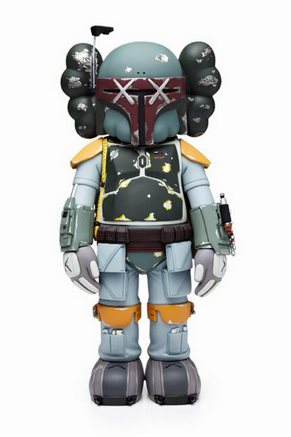
OriginalFake KAWS Boba Fett Companion Tokyo Exclusive
Boba Fett, is the subject of the latest KAWS Companion release from OriginalFake. This has been a first figurine in a while that’s got me excited. The collaborative figure is due to be available in limited quantities in Japan as an OriginalFake Tokyo exclusive on January 26.
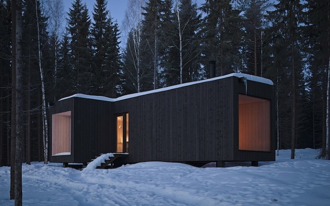
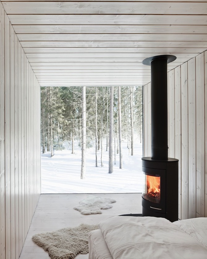
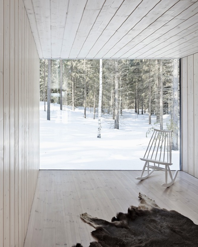
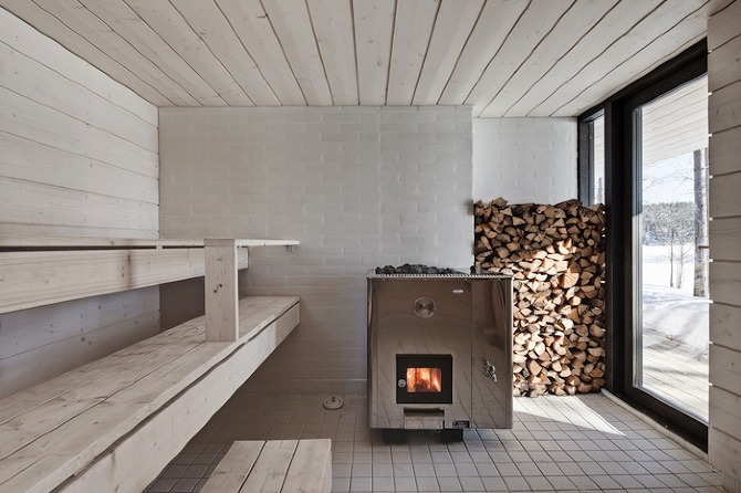
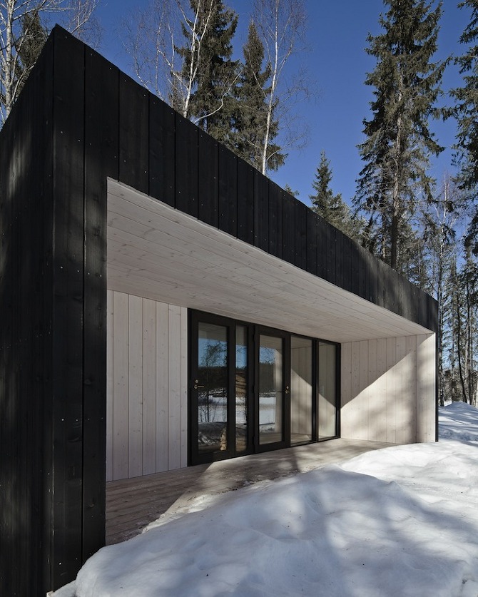
Four-cornered Villa by Avanto Architects
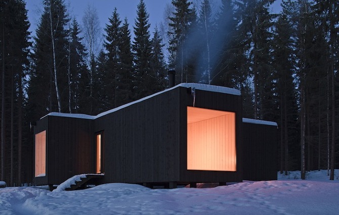
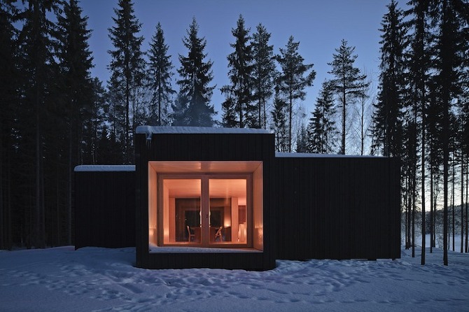
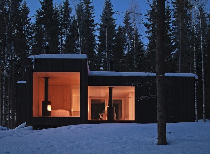
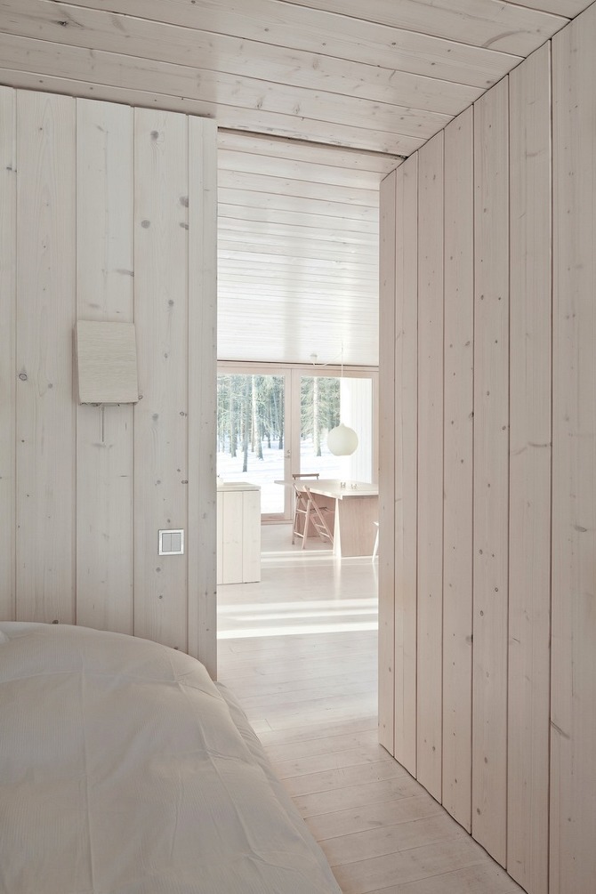
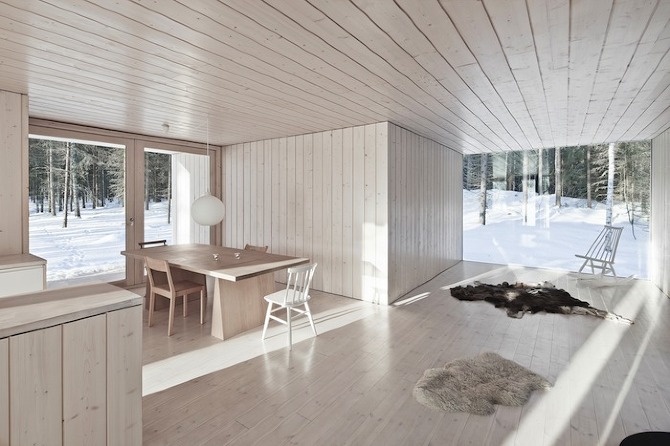
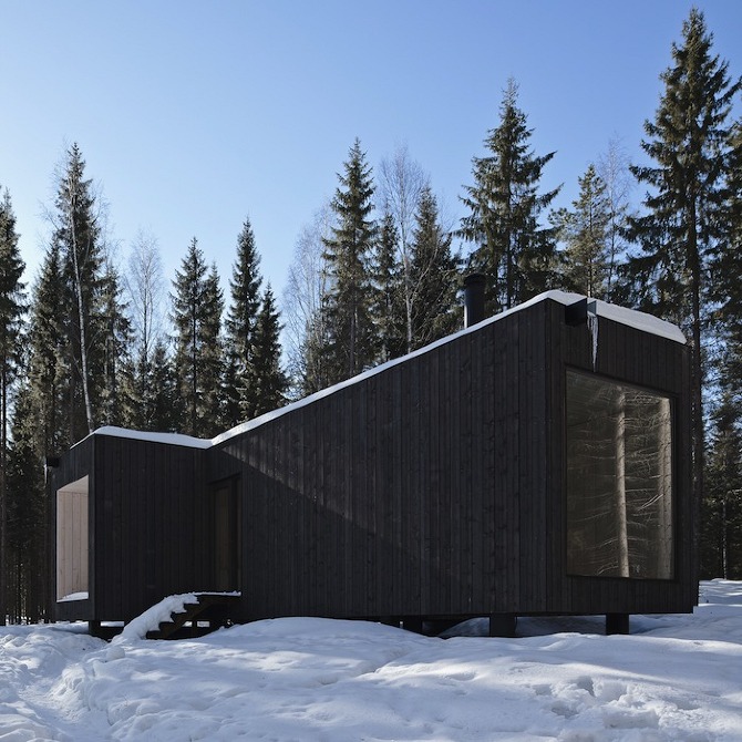
The site is situated on a horseshoe shaped island and faces north and east. The cross like shape of this simple villa reaches towards four very different views. There is no one and only direction on the site as usually, but you can see lake in three directions and you have a nice forest view to the west. You get morning light at the breakfast table, midday in dining room and evening in sitting room. There is no direct sunlight in the bedroom so you don’t need curtains. Terraces are covered to prevent the hot summer sun overheating the building but allowing passive solar energy in the winter.
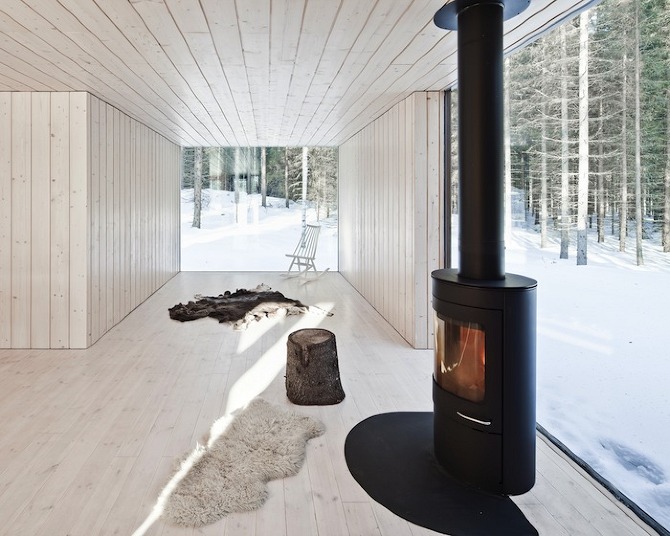
You can open the double doors to the terraces so that the limit of interior and exterior disappears. The space is open and defined at the same time. The exterior is treated all black to contrast the interior, which is very light. Dark color makes the building disappear totally when seen from the lake. The roof is flat – there is some warm irony to the clichés of modern architecture.
The basic idea is to provide an example of sustainable cottage in contrast to normal Finnish cottages that are heated all year round with electricity to prevent water pipes from freezing. The building is insulated well and heated by wood from own forest only resulting in a carbon neutral building. There is no running water and the electricity is provided by the sun. Vegetables and herbs are cultivated on site and the Vaskivesi Lake is known as a good place to catch pike-perch. The simple and ascetic life at the countryside differs dramatically from the hectic city life and provides a possibility to live a life with a minimum impact to the nature.
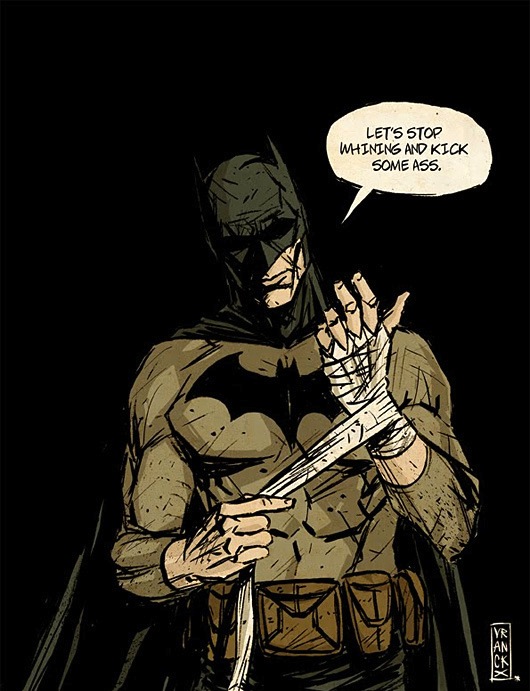
Illustrations by Gilles Vranckx
Great illustrations by Gilles Vranckx, an artist based in Brussells, Belgium.
“Gilles Vranckx was born with a pencil in hand. He studied graphic design, animation and comic art. His influences range from Ashley wood, Kent Williams, Mike Allred, to Rene Gruau, Edward Hopper and old 50′-60′ ads.”
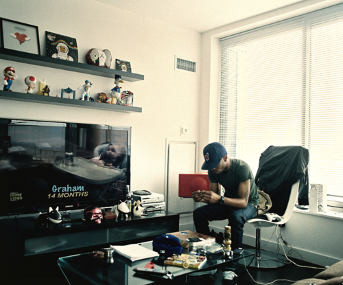
Kid Cudi
Scott Ramon Seguro Mescudi (born January 30, 1984), better known by his stage name Kid Cudi is an American alternative hip hop recording artist, singer-songwriter, guitarist, record producer and actor from Cleveland, Ohio.
Source
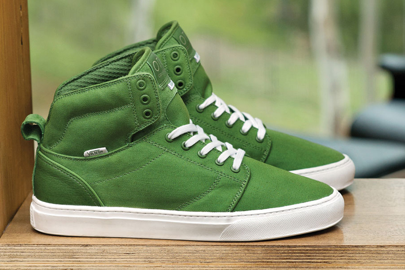
Vans OTW 2013 Spring Alomar
The Alomar from Vans OTW returns for Spring 2013 with the in-house “Basic” pack. In green, black, red and white colorways, the pack includes canvas uppers and leather heel counters alongside tonal eyelets, mesh lining and white rubber foxing coupled with matching laces. Additionally, the blacked-out edition of the lifestyle high-top incorporates pigskin suede throughout for an added premium touch.


