Category Archives: DESIGN
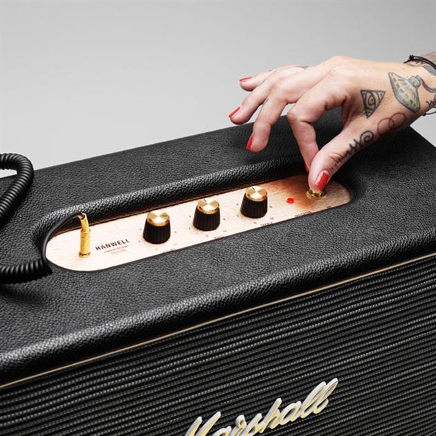
Hanwell Active Loudspeaker by Marshall Amps
The latest to hit the retail scene from the brand founded by the late Jim Marshall is this Hanwell Loudspeaker celebrating the brand’s 50 year anniversary. Built to look like a smaller version of their well known amps, this small cabinet sports dual long-throw woofers to produce super lows along with hi-fi tweeters which help with sharp extended highs. The Marshall speaker will find itself right at home in dorm rooms, as the size makes it extremely portable. As of right now, there is no official price tag for the device, but we expect it to be selling for a hundred dollars when it lands at the official Marshall website.
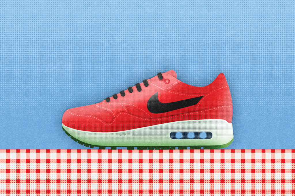
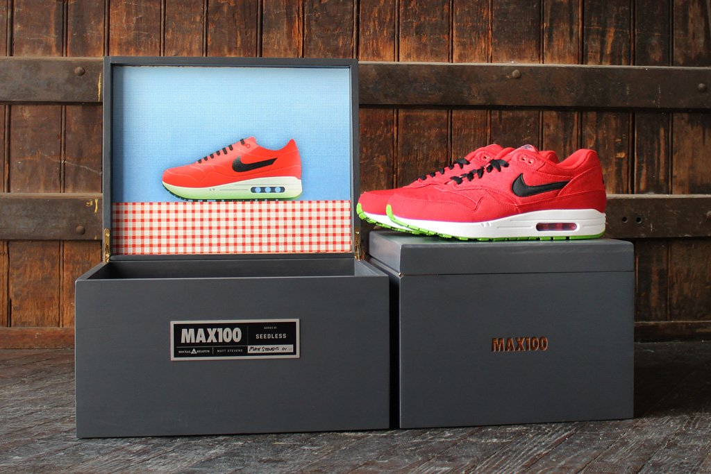
Social Status x MAX100 x Nike Air Max 1
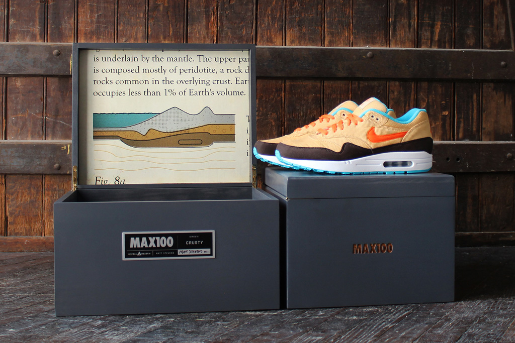
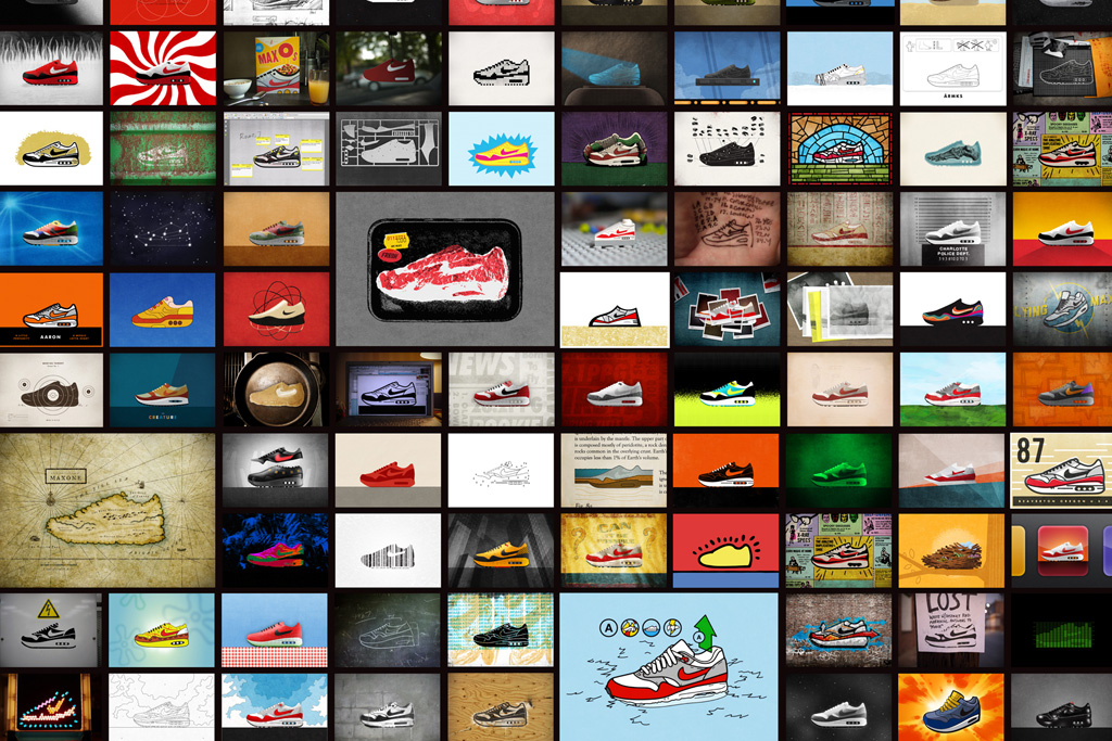
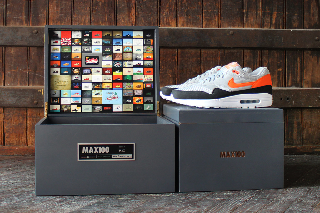
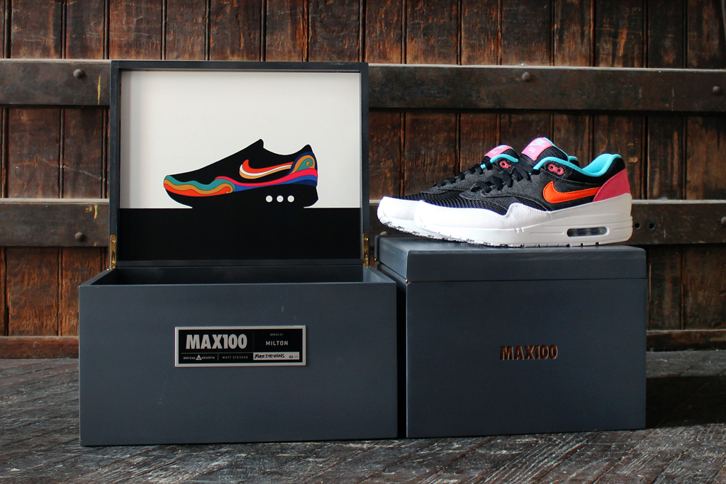
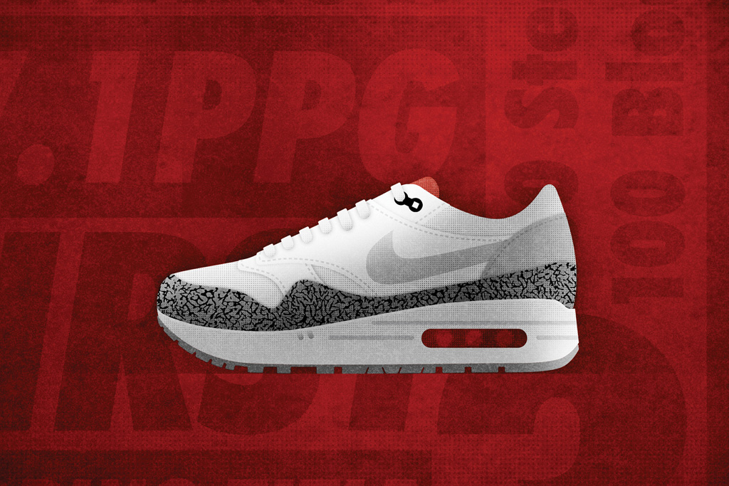
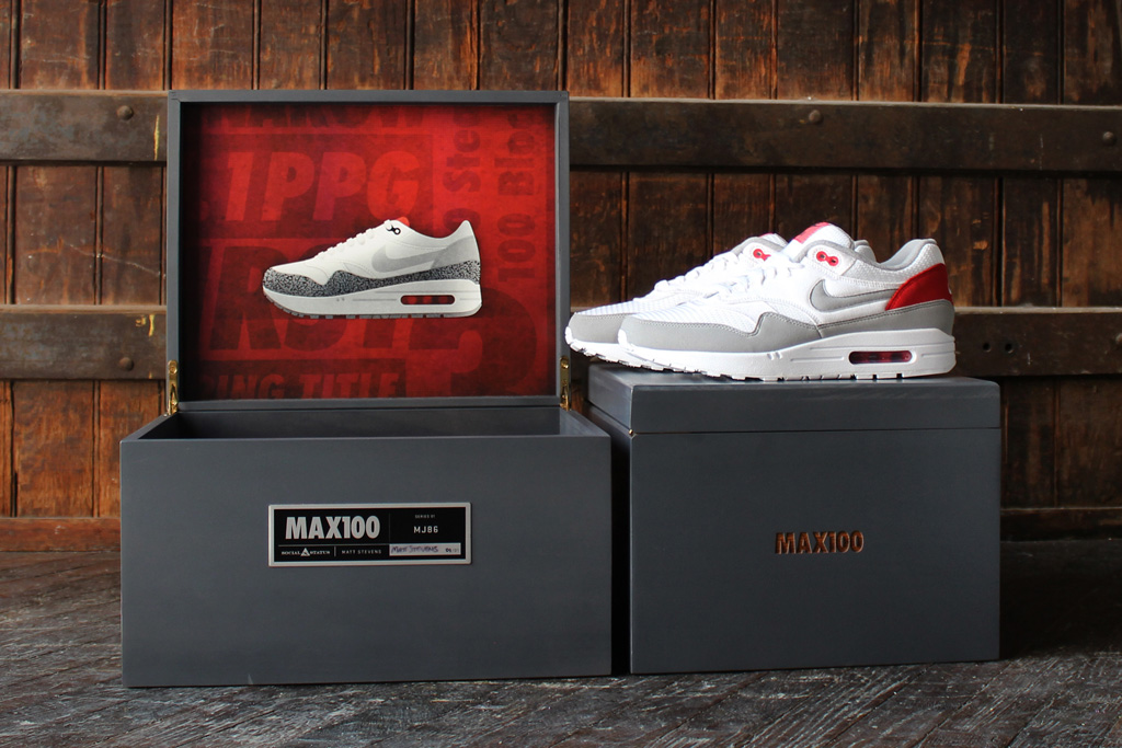
MAX100 Project launched a few weeks ago with Social Status, Nike and illustrator and designer Matt Stevens. Here are a first look into the pack of 10 Air Max 1s which will soon go on the auction block to benefit Charlotte, North Carolina-based charities. Each one off pair were inspired by illustrations produced and published by Matt Stevens in his MAX100 book packaged in a signed wooden box set including artwork and MAX100 book.
The 100 Most Influential Artists Of The Complex Decade
Complex Magazine Article –
If one thing is certain about the past 10 years, it is that the intersection of arts and products has become more transparent. We’re a generation spurred by collaboration and charged up by the potential of visual arts to better almost every idea. Remember the Bird’s Nest, Beijing’s Olympic Stadium? Even that famous building was a collaborative effort between architect and conceptual artist.
Influence is a tough thing to pinpoint. However, we can easily celebrate the people that enriched our aesthetic options and made us think. Some of these folks created new products, others challenged gallery installations. We don’t one type of art making over any other. Instead, we tip our hats to all who brought distinct and exciting visions to our daily lives.
In short, these are the artists who have shaped our vision of world over the past 10 years.
PBS Off Book: The Art of Animation and Motion Graphics
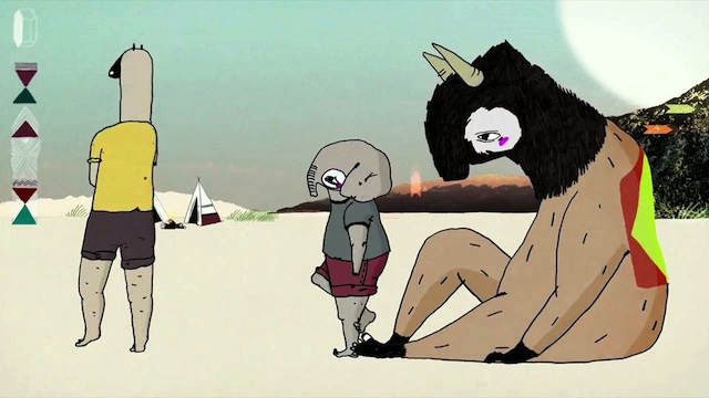
Animation has been captivating audiences for more than a hundred years. From classic forms like hand drawn and stop-motion, to cutting-edge techniques like motion graphics and CGI, animation has a long history of creating style and poetry unachievable through live action filmmaking. It is a tool for educating, a place for experimentation and play, and a way of telling personal stories that reach the viewer with powerful visual metaphors.
Featuring:
John Canemaker, http://en.wikipedia.org/wiki/John_Canemaker
Jesse Thomas, Jess3 http://jess3.com/
Justin Cone, http://motionographer.com/
Julia Pott http://www.juliapott.com/
The World’s Largest Edible Gummy Bear
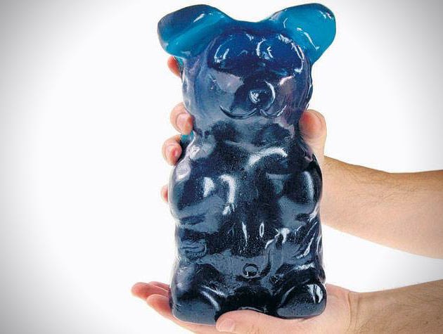
Weighing in at five pounds, the World’s Largest Gummy Bear is perfect for individuals obsessed with the iconic candy. The equivalent of 1,400 standard sized gummy bears, this massive piece of candy is staggering 12,600 calories of goodness and stands 9 inches tall. Certainly not your typical bite sized snack, these might be better split among you and several of your friends. There are several different flavors available, all of which can be purchased from Amazon.
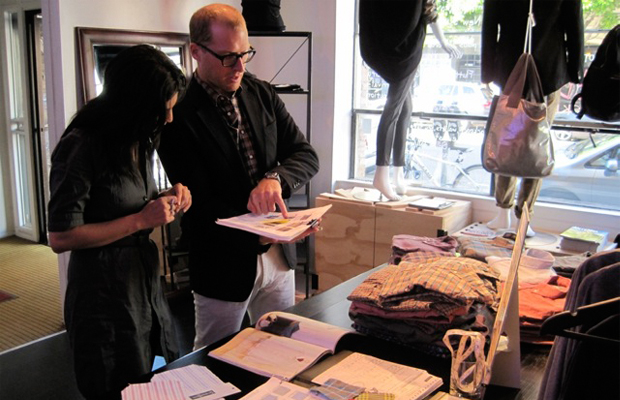
8 Things To Avoid When Starting A Brand
Complex Magazine Article –
TOO BIG OF SALES
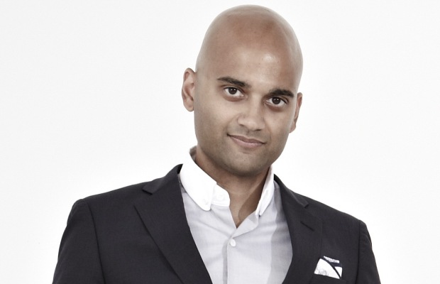
Chris Olberding, Gitman Vintage
“When the buyer asks, ‘Do you have minimums?’ I always respond, ‘No, only maximums.’ One good rule of thumb: it’s better to start off saying no to potential accounts when it’s not exactly where you want to be. When it is, make sure you don’t let them overbuy—it keeps the sell-through high and the demand higher. Product is always King, but the Queen is keeping it tight. I can’t name names with this one, but making too big of a sale has happened and I had to deal with the residuals.”
MANUFACTURING PROBLEMS
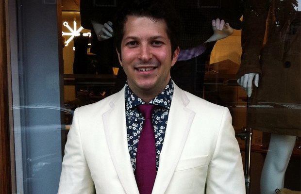
Pranav Vora, Hugh & Crye
“In our first collection (F/W 2010), we had a French/double cuff shirt in two colorways; blue and white two-ply Italian poplins. Our production prototypes looked great, and we were excited to introduce a more formal shirt to our conservative base in Washington, D.C. When we received our product and were inspecting it, we noticed the cuffs were off. The manufacturer actually produced the shirts with ‘convertible’ cuffs—ones that have buttons like you would expect in regular shirts, but an extra button-hole so that they can be worn with cuff links as well. Oddly enough, the convertible cuff has done extremely well with our customers. They love the flexibility, especially over a French cuff shirt. We weren’t happy about the manufacture messing up, but in the end, our customers didn’t mind the convertible cuff, and in fact preferred it. We continue to produce the convertible cuff in many of our styles today for that reason.”
LACKING PATIENCE
Billy Moore, Cause & Effect
“Well as far as horror stories go, just starting a brand is scarier than anything Freddy Kruger has ever dreamt up. The stress is crazy, the hours long, and money non-existent. That said, the first time someone else loves what you created puts you in a state of euphoria. The most valuable lesson I have learned involves patience and faith in yourself. I have wanted my stuff in stores so badly that I have put it on consignment and in stores I knew were sketchy pays. It left me short on cash and depressed. Believe in your product and ask around about stores. The menswear market is really small and most info is just an email or two away. Always value yourself and your time but when you do give in to the moment (and you will) and go against your instincts, step back, have a beer and a shot of moonshine, and do what you do best—making something really fucking cool.”
DESIGNING FOR TRENDS
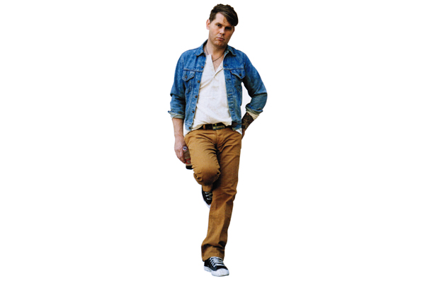
Michael Kule, Epaulet
“The biggest mistake that I’ve made is designing for someone outside of my customer base. As much as I might personally admire really directional and off-kilter designs, our customers ultimately come to us for things which are modern, versatile, and classic. When I’ve tried to make things which are too trendy and expensive, they’ve generally flopped. That’s not what guys want from our brand.
“Overall, this experience has helped me to keep centered. You can’t—and shouldn’t try to be—all things to all people. Doing good clothing design isn’t a speech, it’s a conversation. You have to listen to your customers and work to make what they’re really looking for. You need to push the envelope and use your own vision, but you should be conscious of delivering a product that people will want and accept from you. Ultimately, I’m very good at selling navy sportcoats, wingtips, and slim trousers. I need to leave the hardcore directional streetwear stuff to the people who do it best.”.
TAKING A GAMBLE ON PRODUCT VOLUME
Mega, Black Scale
“There are obstacles of running a company daily, especially being an independent company. We are trying to run a machine without all the knowledge other successful companies have. We learn everyday and mistakes are always made but the scariest part I ever experienced was when a big retailer like Metro Park closed and they owed us $100,000 plus, which would probably be nothing to a big company, but for us, funding everything we do on our own, something like that can kill you.
“We took that experience and really changed up our distribution game. We stopped gambling and started making just enough so we know the volume we are making won’t kill us in case another big door business shuts down. The craziest part about that was they accepted all the goods in their warehouses the day before we got the bankruptcy papers telling us Metro Park will be going out of business. People will snake you and don’t give a fuck who you are because all they are worried about is their own business. Always make sure you have a great relationship with the smaller guys with smaller doors and create a product that the bigger doors can sell out so your money is guaranteed.”
WRONG BRAND IDENTITY AND STARTING A BUSINESS WITH FRIENDS
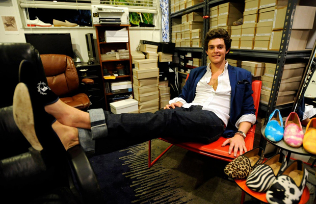
Matthew Chevallard, Del Toro Shoes
“First off, starting a business with friends is a nightmare. Always remember to put every imaginable provision on paper before a business is started with your friend.
“Another important lesson is one must build a company around sales, a concept, and build organically from there. My two business partners who ran the company before I did were very scattered in developing Del Toro and as a result the company almost went belly-up before I took it over. I focused on moving product and sales and figuring it out from there what actually worked.
“My business partners thought that we could kill the market by introducing velvet slippers with customization at a much more affordable price level. Therefore, they bought 75K in inventory of black velvet classics and a 20K Toyota embroidery machine thinking we could do embroidery directly onto them. They were sadly disillusioned after the fact that that is impossible. Therefore, the first two years, we realized our business model was flawed and we were digressing day by day. When I took it over, I wanted to switch the focus from customized velvet slippers and a mom and pop feel company to a lifestyle luxury brand. My intent was to move beyond the velvet slipper as soon as I had the chance. Also, I had no interest in being a bootleg velvet slipper company with no identity. Therefore, I moved the company to Miami from Palm Beach and began crafting the identity Del Toro stands for today: a luxury lifestyle brand influenced by American Prep x Italian elegance x NY/ Japanese streetwear sneakerhead culture.
“The list goes on and on with hiccups and bumps and the moral of the story is you live and learn from every mistake and everything is to be learned from. Important thing is you evolve and hone yourself with every challenge instead of being crippled by it. Ultimately every annoying bad thing that happened to me was a blessing in disguise that helped me find a cheaper and more efficient way.”
NO PRODUCT TESTING
Christian McCann, Left Field NYC
“One of the biggest mistakes I’ve made was not doing my own shrinkage tests. What they don’t tell you when you first start out is that the same jersey or fleece knit can and will shrink differently based on the color it’s been dyed, and/or the lot it comes from. Making matters worse is if you’re getting your fabrics from a jobber [Ed note: the middle man charging “discount” prices], ’cause they’ll send whatever they have, not necessarily what you ordered. I learned this the hard way my second season out.
“For my first run of sweats, I used an 80/20 cotton poly fleece. When I reordered, I was sent a 95/5, but I was told it was the same 80/20. So, I did the run, and what do you know, I ended up with sweatshirts much shorter then the first round due to the higher cotton content. Luckily, most of my business was in Japan at the time, and they already thought my sweats were too long, so it worked out okay. But, moral of the story is never trust jobbers—they all lie—and always check your fabric shrinkage on your own before doing a production run, or prepare to pull out a lot of hair, and lose a lot of money.”
NOT FOLLOWING YOUR OWN RULES
Eunice Lee, UNIS
“Here are ten things I learned. First, know that you’re in the business of being in business. If the business side of things isn’t sound, the brand isn’t going to survive. I think most designers aren’t really aware of what they’re getting themselves into, we have a tendency to romanticize everything. Second, focus on a few good things. Do it differently and do it better. I used to design a much larger collection. Looking back, I cringe at how much money I wasted. Less is more.
“Third, know who your customers are. If you don’t know who’s going to be buying your product, stop now. When I first opened the store, I was shocked to see who came in. My guy was so different than I imagined him. Having the store has been one of the best things that’s happened to me as a designer. Fourth, the most expensive mistakes I’ve made were made out of impatience. Urgency is necessary, but desperation can be hurtful. Things have a way of unfolding the way they’re supposed to. Fifth, learn how to build relationships. They are so crucial to survival. After all, you never know when you’re going to need a favor.
“Sixth, hire an accountant and book keeper immediately. Seventh, hire a lawyer too. Trademarks are a complicated mess. Eighth, don’t trust anyone who says ‘trust me.’ Ninth, pay your dues, and get some experience. Don’t yell at your factories for not knowing what you’re doing.
Red Bull Upstream 2012: Wakeboarding Upstream in Slovenia
Robert Pokovec & Dominik Hernler travel Slovenia looking for new possible locations for the next edition of Red Bull Upstream. The two athletes tested out Bled Gorge before traveling to the famous Soca River, which fascinates with its beauty. Despite freezing water temperatures, Robert and Dominik put on a show at both locations.
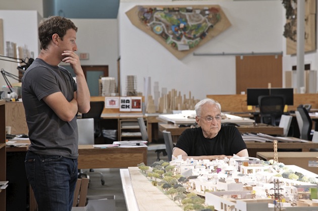
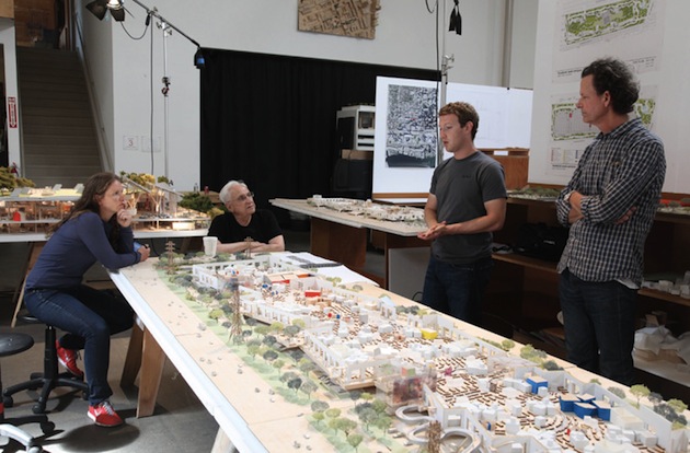
Frank Gehry and Mark Zuckerberg Collaborate On Facebook Headquarters
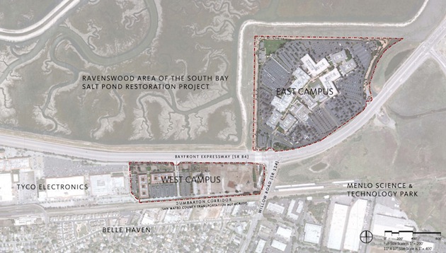
Gehry Partners has been commissioned to create the complete “campus” design of the 22 acre headquarters and while it’s in its beginning stages. The building scope itself will take up 10 of the acres, with the 435,000 square feet of interior space being used for open collaboration and a freestyle “warehouse” style approach to work stations to maximize flexibility. As of now, construction is set to begin in 2013. Stay tuned for more information as the details become more concrete.
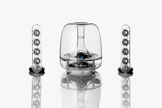
Harman Kardon’s Iconic Soundsticks Go Wireless
GIZMODO Article –
Designed by Jonny Ive himself, the first Soundsticks were inducted into MoMA’s permanent collection. And now, they’ve gone wireless. For the most part, the speakers are the same: 10 watts in each satellite and 20 watts going into the subwoofer. But now it has Bluetooth baked in, and though that may not offer quite the same audio fidelity as a wired connection, it does mean a cleaner appearance for those more concerned with aesthetics. But that convenience comes at an added cost. Instead of the $200 pricetag of the Soundsticks III (which can be had even cheaper on the street), expect to pay $230.
Apple Confirms September 12 iPhone 5 Launch Event
Apple has officially announced that the iPhone 5 will be unveiled at a special event on September 12. uspected features include a thinner, taller iPhone with a 4-inch display – which abandons the 4:3 aspect ratio for one more like an HDTV. Rumors suggest Apple will start taking iPhone 5 pre-orders after the event wraps up – offering consumers the chance to lock in a release day delivery. While Apple is not confirming this, rumors point to a September 21 iPhone 5 release date.
Black Lodge by Jägnefält Milton
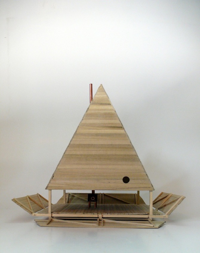
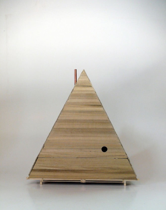
“The basic idea is to complement a luxury resort (situated in an old quarry) with small reclusive huts placed in the nearby forest, close to a deserted beach. Considering all the luxury amenities in the resort, we wanted this to be something completely different. The huts are made of pine trees cut in the same forest as they are standing in. It’s built in an old swedish timber frame technique and warmed by a cast iron stove. The only furniture besides a stool, is a wooden board that can act both as a table, a bench and a bed. All four walls can be opened into the grass creating more of a camp fire situation where you can watch the stars and moon through the oculus. We were able to stretch the simplicity of the project knowing we had all the amenities nearby. The resorts name is Furillen and a first prototype is going to be built this winter.”
Microsoft Unveils a New Look
It’s been 25 years since we’ve updated the Microsoft logo and now is the perfect time for a change. This is an incredibly exciting year for Microsoft as we prepare to release new versions of nearly all of our products. From Windows 8 to Windows Phone 8 to Xbox services to the next version of Office, you will see a common look and feel across these products providing a familiar and seamless experience on PCs, phones, tablets and TVs. This wave of new releases is not only a reimagining of our most popular products, but also represents a new era for Microsoft, so our logo should evolve to visually accentuate this new beginning.
The Microsoft brand is about much more than logos or product names. We are lucky to play a role in the lives of more than a billion people every day. The ways people experience our products are our most important “brand impressions”. That’s why the new Microsoft logo takes its inspiration from our product design principles while drawing upon the heritage of our brand values, fonts and colors.
The logo has two components: the logotype and the symbol. For the logotype, we are using the Segoe font which is the same font we use in our products as well as our marketing communications. The symbol is important in a world of digital motion (as demonstrated in the video above.) The symbol’s squares of color are intended to express the company’s diverse portfolio of products.
Starting today, you’ll see the new Microsoft logo being used prominently. It will be used on Microsoft.com – the 10th most visited website in the world. It is in three of our Microsoft retail stores today (Boston, Seattle’s University Village and Bellevue, Wash.) and will shine brightly in all our stores over the next few months. It will sign off all of our television ads globally. And it will support our products across various forms of marketing. Fully implementing a change like this takes time, so there may be other instances where you will see the old logo being used for some time.
We’re excited about the new logo, but more importantly about this new era in which we’re reimagining how our products can help people and businesses throughout the world realize their full potential.
Posted by Jeff Hansen
General Manager, Brand Strategy, Microsoft
Bentley Announces Mulsanne Convertible Concept
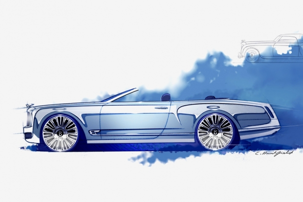
The Mulsanne Convertible Concept is set to be the planet’s “most elegant and sophisticated convertible,” the Mulsanne Convertible Concept fuses the sportiness of a drop-top with the elegance of the original handmade coach for the ultimate modern take on the tourers of the early 1900s. According to Bentley chairman and Chief Executive Wolfgang Durheimer, “The modern, luxurious, high-tech Mulsanne saloon provides a perfect foundation on which to create the world’s most elegant convertible. The Convertible Concept will extend the appeal of the Mulsanne family, while enhancing the profile of the Bentley brand, particularly in new and emerging markets.” Currently existing only on paper.
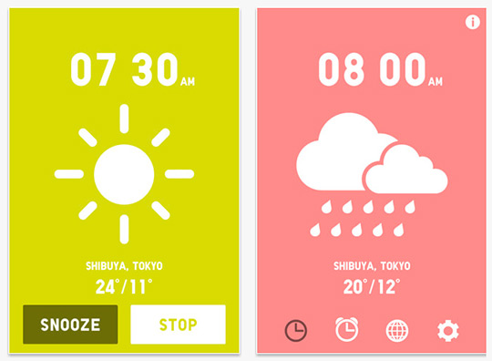
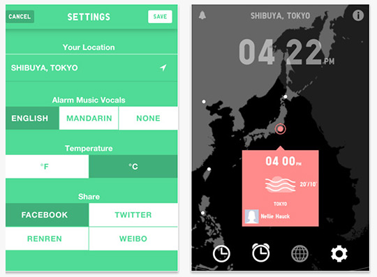
UNIQLO Wake Up App.
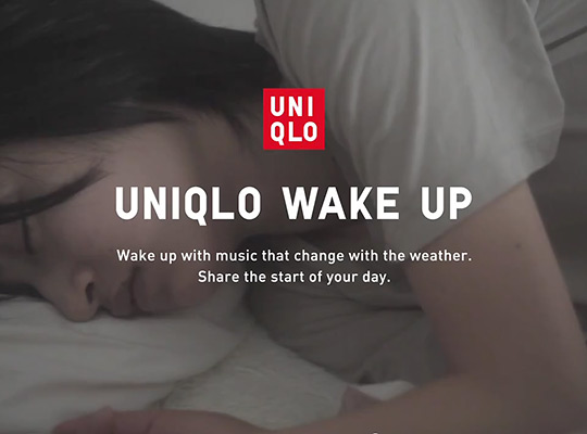
The UNIQLO Wake-Up app, available for the iPhone and Android, is a pleasant wake-up “alarm” with tone and music set by Cornelius (‘Respect is Burning Tour’ with Daft Punk) and Yoko Kanno – play the video below for a sense of it. As well, alongside, a soft spoken voice that tells you how the day will look weather-wise.
Bastard Store and Office by Studiometrico
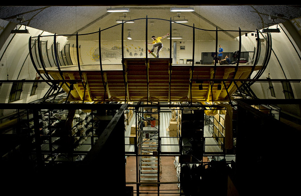
The Bastard Store and Office is a great example of modern day work spaces that also give you facilities to let a bit of steam off and take the sigh out of everyday going to work. Bastard Store and Office has a terraced office that overlooks a large wooden bowl built for skaters to shred in their downtime. Below the bowl, a full-service retail store welcomes the public in local Milan, Italy.
MC2000 DJ Controller
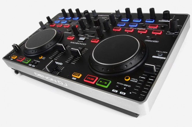
Denon has just released the MC2000 DJ controller. Specifically designed for Serato’s DJ Intro mixing software this entry-level device comes along with a plug and play USB device and a copy of the Serato software of course. The MC2000 features a basic two-channel mixer between the wheels, all the usual buttons for hot-cues and loops, the audio interface is built-in for easy use. The Denon MC2000 is available from October.
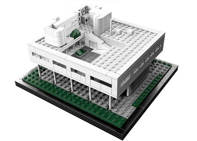
LEGO Architecture: Le Corbusier’s Villa Savoye
The Le Corbusier’s Villa Savoye home was designed in 1931 in Paris and is still there today if you’re in the neighbourhood. The LEGO Architecture set launched in stores today.
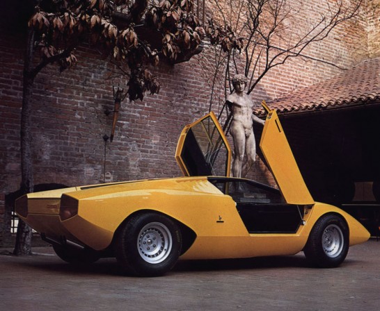
Lamborghini Contach
Only 3 years after Bertone released the first wedge-shaped Alfa Romeo Carabo concept, Lamborghini got their turn with the Countach in 1971. Among all the prototypes with this universal shape, Lamborghini became the most prolific when the car was put into production in 1976. The car was named after it’s 5000-litre V12 which stood for Longitudinale Posteriore 5000.Marcello Gandini, who had shaped both the Miura and Espada was responsible for the Countach design. The low profile wasn’t too far off his Lancia Stratos 0 from just a year earlier, and Lamborghini remained much more true to the Bertone concept than Lancia ever did. Maybe that’s why the Lamborghini became so much more of a icon than the Lancia.Unique traits of the concept included forward-swinging doors from the Carabo and a periscope rear view mirror, both which were retained for production.Paolo Stanzani had the task of making a usable supercar underneath Marcello Gandini’s impossibly low design. He elected to run the gearbox forward of the engine to provide direct gear changes. This raised the height of the engine for the driveline, but made the Countach look even more purposeful with its muscular rear stance.Initially a fully-digital instrumentation system was fitted that was later replaced by analogue units so Bob Wallace could test the car. Afterward the car led a hard life and was highly modified during testing to help with production development. At met a final fate with a barrier at MIRA in Britain which destroyed the car completely.
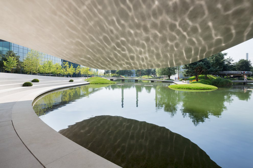
Porsche Pavilion by Henn Architekten
The new Porsche Pavilion at the Autostadt in Wolfsburg, Germany is the first addition to the theme park since its 2000 opening. Designed by German firm Henn Architekten, the curved lines and form are derived from the ‘dynamic flow of driving’, encompassing the universal image of the Porsche brand. following a similar construction to that of monocoque technology – applied to the development of lightweight designs within the automotive and aerospace industries – the sculptural piece of architecture forms a spatial enclosure while acting as a load bearing structure at the same time. At its entrance, it cantilevers outwards at a length of 25m, hovering over the water surface of a built-in lagoon in which a circular walkway runs the perimeter of, allowing visitors to further explore the Autostadt. The exterior is covered in 620 matte-finished stainless steel cladding with welded ribs which were prefabricated in a ship-yard in stralsund and assembled on site resulting in a seamless building skin, positioned within the park in such a way that it mirrors the location of the Volkswagen Pavilion. the surrounding landscape has been executed by WES to make sure the new pavilion seamlessly blends into the overall themes of the surrounding existing park.
An elliptically curved ramp embraces the dynamic principle of the architecture, leading visitors into the interior concept developed by Hg Merz Architeckten Museumsgestalter. the lower 400 m2 exhibition and staging areas house the original Porsche – a 356 no. 1 built in 1948 – which is the starting point of the space, leading to a collection of 25 silver coloured vehicle models at a scale 1:3, presented within the main display area. On show are short films which express the four antagonistic terms which characterize Porsche’s values and philosophy: tradition and innovation, performance and day-to-day practicality, design and functionality, exclusiveness and social acceptance. A film about the company’s history along with sound stories and other Porsche models are also presented to give an overall informative overview of the automotive brand and its history.


