


- DESIGN
- ART
- STYLE
- ARCHITECTURE
- PHOTOGRAPHY
- FOOD
- TECHNOLOGY
- MUSIC
- MOVIES
- CULTURE
- TRAVEL
- PERSONAL
-

SUBSCRIBE


Category Archives: CULTURE
The Wythe Hotel in Williamsburg, Brooklyn, NY


Wythe Hotel started with the discovery of an old factory on the Brooklyn waterfront. Built in 1901 as a cooperage, we have preserved, renovated, and turned our historically industrial building into a place where people feel welcome.
80 Wythe Ave. at N. 11th Williamsburg, Brooklyn, NY 11249
P:718-460-8000 F:718-460-8001 hello@wythehotel.com
Click here for more information.
Posted in DESIGN, ARCHITECTURE, PHOTOGRAPHY, CULTURE, TRAVEL
Leave a comment
Food and Fashion by Fulvio Bonavia


The great editorial photographer Fulvio Bonavia has merged a passion for fashion with the love of food to create a series of style accessories out of fruits, vegetables and more. These creations are amazing!
Posted in DESIGN, PHOTOGRAPHY, FOOD, CULTURE
Leave a comment
The IKEA Premiere of UPPLEVA

")

The Times Of India Article –
IKEA is already the one-stop shop for smart and compact home furnishing. Now they are venturing into the world of technology-with theIKEA TV.
The new furniture range, named UPPLEVA the Swedish word for experience, integrates an LED TV, a sound system with wireless bass speakers, an internet connection and CD, DVD and Blu-ray players-all in one self-assembly piece.
Although the TV and the other electronics are made by Chinese manufacturer TCL, IKEA has built everything around them, hiding the masses of cables that can be a nuisance and make a living room look shabby.
To further simplify things, IKEA and TCL have combined all the controls into a single remote. The furniture surface is especially designed to allow the remote’s signals through, so the devices can remain hidden from view.
The TV screens are available in four different sizes, from 24 inches (60 centimeters) to 46 inches (117 centimeters), and in a range of colors including gray, black and blue. Users are also able to plug in their iPods or other MP3 music players.
Like most IKEA furniture, the UPPLEVA is purchased in a flat-pack and is ready for assembly at home for those handy with screwdrivers and other tools.
The furniture comes in three designs and will be sold first in Sweden, France, Poland, Germany and Italy in June, with a few more marketsdue to launch in the second half of the year. By the first half of next year, it will be available worldwide, with the cheapest costing about 6,500 Swedish kronor ($955).
To test market appetite for its latest innovation, IKEA had a survey conducted by pollster YouGov. The poll showed that three out of four people want less visible cables in their living rooms and 50 percent wanted to reduce the amount of electronics lying about.
The study, done in five countries with more than 5,200 respondents between Feb. 29 and March 15 this year, also showed that 60 percent of the people asked have between three to four remote controls at home.
“We’ve realized that people are watching more TV and are using electronics in their living rooms more and more,” IKEA spokeswoman Ylva Magnusson said. “We came up with this because we found that people want to get rid of the cables and they don’t want those mountains of remote controls either.”
Martin Rask, a 38-year old from Stockholm, said the all-in-one concept sounded interesting but wondered how it could keep up with new technologies.
“The furniture is a tempting idea-I’m wrestling with a bundle of cables at home myself at the moment-but the problem is that so many new things are released all the time,” he said. “I’ve had three different Internet suppliers in the past year for example, and imagine if you had an old VHS player built into your furniture that no one is watching.”
Magnusson at IKEA said that although the electronic devices are physically attached to the furniture, there is plenty of room for customers to put in IKEA-designed add-ons.
IKEA employs more than 130,000 people and has 280 stores in 25 countries. Last year it drew 655 million customers.
Posted in DESIGN, ARCHITECTURE, PHOTOGRAPHY, TECHNOLOGY, MOVIES, CULTURE, TRAVEL
Leave a comment
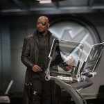
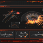
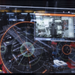
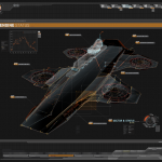
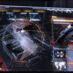
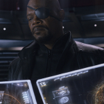
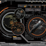
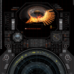
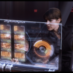
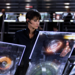
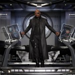
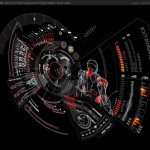
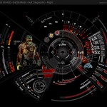
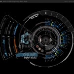
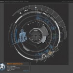
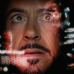
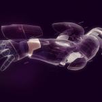
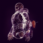
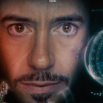
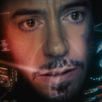
The Avengers user interface designs by Jayse Hansen


Take the time to have a look at all the detail that went into all the interfaces designed by Jayse for The Avengers movie. I impressive. Here’s what Jayse had to say on his site –
This is just an image dump of marvel approved stills and screenshots of my work on the film. I’ll do a proper post soon – this is a fraction of the work – But I had the distinct pleasure of working with Cantina Creative, leading the design of the glass screens for the Helicarier in the Avengers. I also led the design and animation of the all new and upgraded Mark VII Hud.
All work was done in Illustrator, After Effects and Cinema 4d.
Included are some partial explanations of how the HUD diagnostic functions
Variations of it in ‘all clear’ mode, and a ‘battle mode’, after the suit has suffered damage and new windows have popped up to show depleted weapon stores and hazardous environmentals and general.
The flight menu was designed with input from an A-10 Fighter Pilot. I like to keep my stuff accurate – while still taking design liberties that films afford.
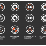
I start all designs on paper so I included some ideas for the dock icons. When I sketch stuff out – I find it important to not use a ruler and give yourself ‘permission to draw badly”. In the final icons, the more detailed versions show system status based on the way they animate.
Add on note – I’m all about giving credit where credit is due (mainly because I’ve never gotten credit until this film – screen designers typically don’t unfortunately.)
A lot of people are giving me sole credit for everything designed in the film – but I don’t deserve that much credit. I like to always mention that I was part of a small elite crime-fighting team called Cantina Creative.
This page represents just a small part of what I did in my 7 months buried in the Avengers Universe, and an even smaller part of what the entire team did for the film. There’s also the Loki search monitors, the on screen playback monitors, stark devices and the science lab monitors (which just used my designs as the foundation framework.)
We had a ton to do – these screens are seen in over 70% of the film, and I’m proud of what our team pulled off under the guidance of the always awesome Venti Hristova.
We all worked super hard on this film – and became a family of friends for life. So I just wanted to give a shout out to my fellow Cantina peeps here:
Visual Effects Producer
Sean Cushing
Creative Director
Stephen Lawes
Visual Effects Supervisor
Venti Hristova
Visual Effects Coordinator
Lilly Shapiro
Assistant Coordinator
Jason Ramsey
“Club Suave” badass Design and Animation team
Jonathan Ficcadenti
Alan Torres
Navarro Parker
Sang Shin
Asuka Ashizawa
Takashi Takeoka
Sarah Blank
Lukas Weyandt
Leon Nowlin
Jayse Hansen
Avengers TM & © 2012 Marvel and Subs
Posted in DESIGN, PHOTOGRAPHY, TECHNOLOGY, CULTURE
Leave a comment
Illustrations by Ekaterina Koroleva


Amazing watercolor illustrations by Berlin-based graphic designer and illustrator Ekaterina Koroleva.
Posted in ART, CULTURE
Leave a comment
High Tech Transformers Ride at Universal Studios
![]()
![]()
Fans of the Transformers film series will be happy to know that director Michael Bay worked closely with Universal in designing the ride. As the director of all three Transformers films, no one is more knowledgeable about the intricate details and nuances of the robotic superheroes than Bay. Thus Universal was guaranteed a ride that is true to the films and that will appease the most exacting Transformers fans. When Bay signed on as creative consultant, he demanded that Universal hire the visual effects company of his choosing, and not the one they already had lined up. Bay felt that only Industrial Light and Magic(ILM), a division of Lucasfilm LTD, could handle the “characters made up of 25,000 parts.”
Posted in DESIGN, TECHNOLOGY, MOVIES, CULTURE, TRAVEL
Leave a comment
Baxter of California Grooming Guide
This was a humorous and informative take on male grooming.
In an animated short that harks back to the 1940s Americana educational videos, Baxter of California teaches the young modern man how to properly groom oneself, as well as educating on the development of the technique. The video which is just shy of five minutes offers a substantial guide to grooming that highlights an array of Baxter products from their Hydrating Body Wash to their Herbal Mint Toner. The addition of a Mad Men-esque narration adds to the effect that will aid in the revival of the refined gentleman, today.
Posted in STYLE, MOVIES, CULTURE, TRAVEL
Leave a comment
Kanye West vs Lana Del Rey: Coming to Die (Carlos Serrano Mix)
Posted in PHOTOGRAPHY, MUSIC, CULTURE
Leave a comment
Sushi Time: Sushi Slicers (Episode 3)

StomachLife.com/ is an exploration of creativity through food. “Food inspires Creativity” StomachLife Los Angeles Presents “Sushi Time”: Sushi Slicers, Last Episode of a 3 part series with Chef Sam Sugimoto of CHAYA in Downtown Los Angeles. In this episode Chef Sam gives us insight on sushi knives and shows us how to cut sushi with a Nakiri-Bocho, slice sushi with a Yanagi-Bocho and chop sushi with a Deba-Bocho. He also gives us the scoop of how he orders his knives, which are made from a samurai sword company and can cost thousands off dollars.
Produced by
StomachLife Los Angeles:
MJ Glover
Daniela Ruelas
Shot and Cut by
Mycole-Jerred Glover
Marat Shaya
**Special Thanks to
CHAYA Downtown &
Chef Osamu Sugimoto
Vanessa Kanegai at Wagstaff Worlwide
Posted in DESIGN, PHOTOGRAPHY, FOOD, MOVIES, CULTURE, TRAVEL
Leave a comment
Conference of Cool.
Posted in STYLE, PHOTOGRAPHY, CULTURE
Leave a comment
retaW MOOD* Denim Fragrance Liquid

Anyone that know’s denim jeans, know’s you don’t wash them. Or if you do, it’s once every blue moon. So obviously after a few spilt jagers and that strange smell coming from the backside after sitting in that dodgy stairwell. It surprises me why no one’s thought of this before. The MOOD* Denim Fragrance Liquid has hints of mint.
Posted in DESIGN, STYLE, CULTURE, TRAVEL
Leave a comment
Nike Air Yeezy 2


The Nike Air Yeezy II in both Platinum and Black editions will release June 9 in limited numbers, at select global retailers. Start calling all your hook ups in the sneaker world to secure you pair.
Posted in DESIGN, STYLE, PHOTOGRAPHY, CULTURE
Leave a comment
Shohei Illustrations


My new favorite artist I stumbled across while on my last trip to Tokyo. His work is all done with a ball point pen and the process and detail in his work in amazing.
Computer Arts Interview –
On Shohei Otomo’s website, tucked away behind the visceral and often brutal artwork that he creates, is a self-filmed video of him drawing. The only objects that are in shot are Shohei’s hands, two sheets of paper and a ballpoint pen. From this set-up, he creates some of the most detailed and startling imagery currently coming out of Japan. The video is sped up to double time. Even so, Shohei’s attention to detail and painstaking ballpoint work seems to take an age. He works slowly, but the results, revealed line by line, are mesmerising.
Shohei, who works under the capitalised moniker SHOHEI, was born in Tokyo in 1980, and graduated from Tama Art University with a degree in art, specialising in oil painting. With the oils and canvas discarded, he now creates using ballpoint pens, paper and a fusion of traditional Japanese iconography and twisted, often shocking subjects. Shohei’s artworks often merge conventional character manga with stark sexuality, violence and vulgarity. Yet there’s a deep-rooted humour to his work: geishas wear Bono-esque sunglasses; cherubs hover above a maiden carrying hypodermic syringes; a traditional Samurai coils in fighting position, wielding not a sword, but a heavily painted baseball bat; in another of his pieces, the tip of a severed finger floats in white space contrasted by bright red flashes with the starkness and impact of a twisted Warhol print.
“Back when I was in university, I was just messing around, scribbling stuff on my notebook during my oil painting class,” Shohei recalls. “I wasn’t very good with colours to begin with. I just had more fun drawing with ballpoint – I felt more unrestricted, or free to express myself. Plus I was broke so it was way cheaper than oil painting. When I was 24 I started focusing solely on drawing ballpoint illustrations. I still did oil paintings every now and then, just when I could scrape the money together to pay for all of the supplies,” he continues.
“Back then I was getting a lot of illustration work as a freelancer and working part-time at a convenience store. I designed flyers for my friends’ events and the album covers for their indie bands. I think all my stuff back then was way more hardcore, erotic or grungy. Since my friends’ bands had a similar style and attitude, it worked well.”
While Shohei’s college education taught him traditional Japanese oil painting, his interest and absorption in Western influences and modern Japanese culture explain the conflict his illustrations show. There is a very real sense that his works explore the space where Western culture meets Japanese culture, something that he himself acknowledges.
“I feel Japanese artists create original pieces of work with their natural instincts and overall nimbleness,” explains Shohei. “And they’re very effective at this, but much of what they create is superficial and lacks a sense of depth for me.”
“Western artists on the other hand, tend to take their knowledge of the arts with their solid technical skills and produce very balanced pieces of work, but I have an impression of it being a bit stiff at times. The Japanese use their intuition, whereas Westerners might use their logic more.”
It is this clash of cultural input that defines Shohei’s artwork. There is logic to his process – a very precise, almost painstaking attention to technique and detail that he sees as a Western trait. Yet the results are rooted in contemporary Japanese culture, with obvious reference points and familiar subjects: samurai, geishas, fighting school children and wild-eyed futureshock girls.
This balance is rather notable in Shohei’s creative method, too, while also encompassing many of the traditional techniques used in cartoon – or manga – storyboard creation. After visualising an illustration, Shohei says he then begins planning the piece, and putting a structure in place for the artwork.
“Once I decide what I want to draw, I start sketching out a rough draft with the body movements of the characters, along with wardrobe and prop ideas. I try to draw it out in as much detail as possible until I’m satisfied. I use printed materials, take pictures and even look in the mirror sometimes for reference,” he says.
“Then I take what I have sketched out in the previous stage, and trace it out on an illustration board with a pencil. I then imagine what the end product is going to look like, and start filling in the details with a ballpoint pen. When the details are in, I then take a black marker and fill in the blacks. Once the ink dries, I erase the pencil outline. If there are any imperfections or adjustments that need to be made, then I make those changes and I’m done. That’s my drawing process in a nutshell.”
And what a process it is – simplistic, yet technically detailed, the antithesis of modern, multi-layered digital illustration. It’s also painstakingly slow, yet the precision and detail in his works benefits from this process.
It’s the ballpoint pen technique that Shohei insists makes his artwork so different. After all, the simple colourways and fine detail actually resemble tattoo inking more than they do conventional illustrative artworks.
“When I draw, I can literally feel everything from the tip of the pen all the way to my hands,” says Shohei. “The ink isn’t reflective like the lead tracing of pencils, and best of all it’s cheap! An 80 Yen ballpoint pen lasts me 10 drawings.”
The balance between Western contemporary culture and classic Japanese traditionalism in Shohei’s work has garnered him as much attention abroad as it has in his native land. Several of his shows have been in the United States, where his artworks have proved hugely popular.
“The first show I had was in Kansas City. I was 24,” he says. “In one hour I sold about 20 illustrations, which is insane. I don’t think I’ve sold that many paintings at any of my other shows since. The venue was part of this cluster of art galleries, and it was interesting because there was nobody at any of the other galleries, but my showing was packed! I didn’t know what to expect going into it, but it was probably because they didn’t really have many foreign artists come and show there very often. Having that experience made me want to show my work in the US more. Maybe even move there. But being there for that show, I knew that my work was special because of the Japanese influences I have in my artwork. If I were to move to the States I wouldn’t be inspired to draw Japanese style illustrations. But being inspired to draw something different could be cool too.”
Shohei’s exhibitions in Japan are no less dramatic though. At a recent gallery show in Kanazawa, the organiser asked Shohei to apply his ballpoint technique to human flesh. Using acrylic paint, he created a ‘live’ sketching session, applying make-up and intricate illustrative detail to a model. “It’s actually something that I used to do every now and then,” he admits. “Using some acrylic paint, I just drew some patterns in red, white, and black, inspired by the Kabuki style of make-up (see boxout, left), and created something that would balance out the shape of the model’s body. This show had a pretty decent turnout, maybe 150 people in this small gallery space. It’s rare to have people from Tokyo show their art in Kanazawa, so it turned out really well.”
As well as exhibitions, Shohei has also worked for private clients. While his artworks won’t lend themselves too neatly to mass-market advertising campaigns, they sit in a space where musicians in particular feel an affinity to his style. Like his compatriot, Takashi Murakami, Shohei’s work has found popularity with hip hop and rock outfits, including the post-punk band Japanese Cartoon, which is fronted by renowned hip hop artist Lupe Fiasco. “Lupe Fiasco actually got in touch with me through COMPOUND gallery while I was doing a show there,” explains Shohei. “He was interested in using my artwork. But there wasn’t a lot of time, so I ended up having to use something that I had already completed. So I just trimmed it down a little bit,” he reveals.
When we ask him about his influences, Shohei wears his heart (and his art) on his sleeve. There’s a perceivable cinematic quality to his illustrations, with his characters locked into scenic snapshots. “Kobayashi Masaki’s Seppuku is a favourite of mine,” reveals Shohei when asked which films have influenced his style. “It’s a black-and-white film about a ronin and everything he goes through leading up to his climactic seppuku [a particularly grisly form of ritual suicide by self-disembowelment]. It’s a story about right and wrong, life and death.
“I like Spaghetti Westerns too, especially Sam Pekinpah, director of The Wild Bunch andBring Me the Head of Alfredo Garcia, my two favourite Westerns. I can’t forget Akira Kurosawa – The Seven Samurai will forever remain a classic – and Toshio Matsumoto’s Shurais great too.”
Shohei finds the way in which characters in Westerns and Yakuza films carry themselves intriguing, and will often be inspired to draw after watching them. “But I don’t have any desire to draw perfect ‘Superman’ characters,” he adds. “We’re just not as interesting without our flaws.”
Posted in ART, MOVIES, CULTURE
Leave a comment
ERIC CLAPTON X FERRARI SP12 EC


Eric Clapton is enough of a Ferrari enthusiast that the Italian automaker’s Special Projects Program in Maranello, in collaboration with Italian coachbuilder Pininfarina, designed and built the special SP12 EC one-off for the living guitar legend. The vehicle is inspired by the original 458 Italia, with body panels inspired by the 1980s V12-powered 512 BB, a model with which Clapton was so enamored he purchased three of them over the years. Estimates put the value of the SP12 EC at around $5 million. Slowhand likened his participation in the project as “being in front of a gigantic blank canvas that had to be painted on,” adding that the process was “an incredible experience, one of the most satisfying things I’ve ever done.”
Posted in DESIGN, PHOTOGRAPHY, TECHNOLOGY, CULTURE
Leave a comment
JAY Z & Kanye West: No Church In The Wild

Music video by Jay-Z & Kanye West performing No Church In The Wild feat. Frank Ocean & The-Dream.
Posted in STYLE, PHOTOGRAPHY, MUSIC, MOVIES, CULTURE
Leave a comment
Painted Newspaper Prints by Evan Hecox


Dark Island is a series of mixed-media works by Denver-based artist Evan Hecox, currently on show at the Joshua Liner Gallery in New York City. Evan has a passion for exploring unfamiliar cities with his vintage Polaroid camera in hand, which he later uses to recreate impressions left behind in his memory.
Posted in ART, CULTURE
Leave a comment