Category Archives: DESIGN
The Story Of Sushi
The Story of Sushi from Bamboo Sushi on Vimeo.
The Story of Sushi – a fantastic short film made with miniatures about the many problems in the commercial fishing industry. A must watch for any Japanese food fans.
A project 7 months in the making. All miniatures 100% handcrafted.
For bamboosushipdx.com.
Set Design and Visuals by Lori Nix & Kathleen Gerber [lorinix.net]
Narrated by Jim Donaldson
Executive produced, written, edited by Joe Sabia [joesabia.co]
Directed and photographed by Vincent Peone [vincentpeone.tumblr.com]
Original Score by Michael Thurber [michaelt.org]
w/ AJ Nilles on strings
Sound Design, Music Recording/Mixing by Matt McCorkle [equalsonics.com]
Assistant Camera Andrew Brinkman
Gaffer Cory Fontana
Color by Gloo Studios and Prime Focus NYC
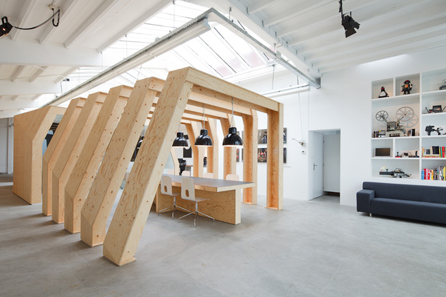
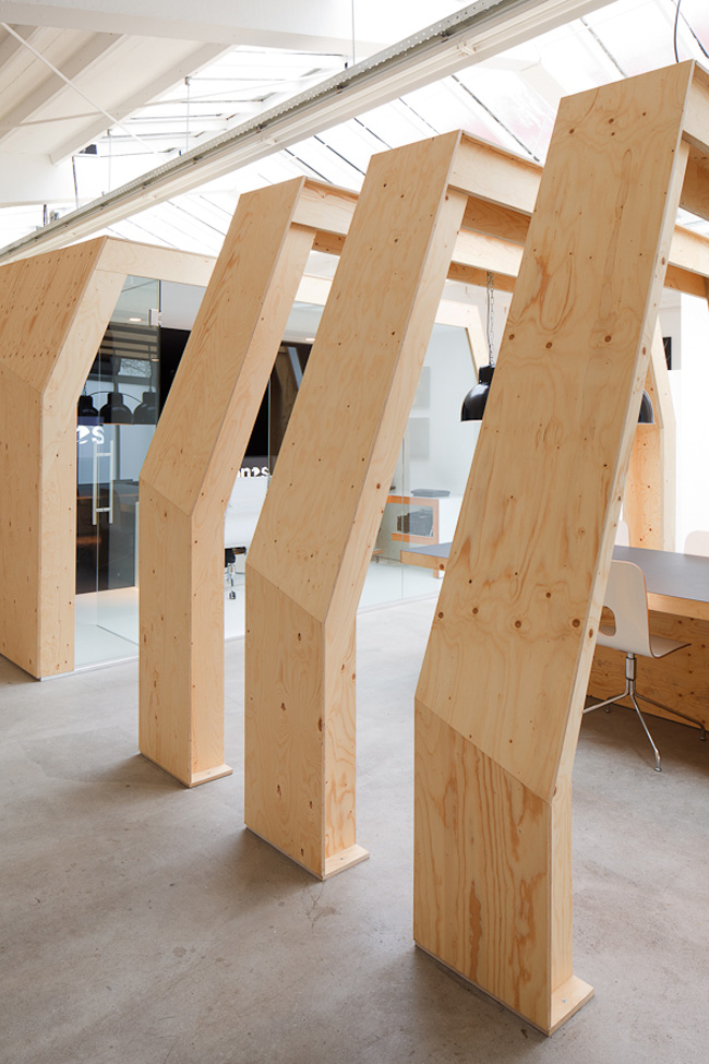
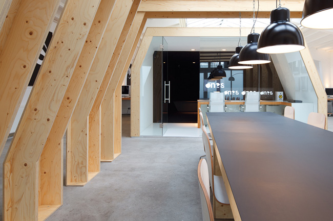
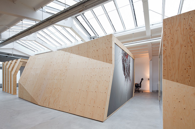
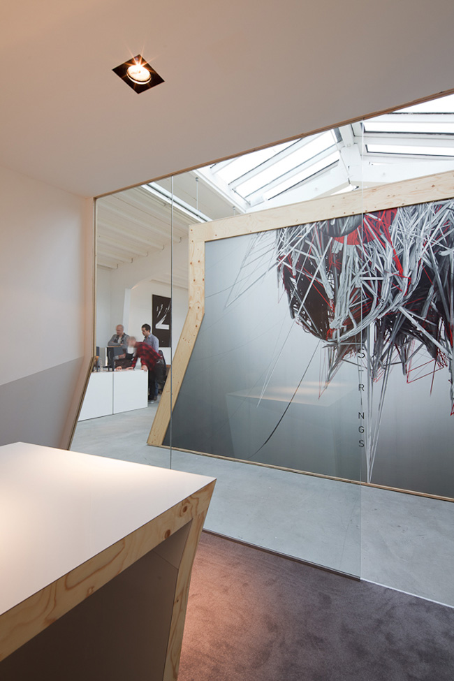
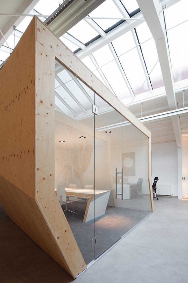
OneSize Office in Amsterdam by Origins Architects.
This office was designed by Dutch firm Origins Architecture for a creative studio OneSize. In order to keep the project cost under control, the designers chose to construct the freestanding structure out of an inexpensive ply material typically used underneath floor coverings. Love the space!
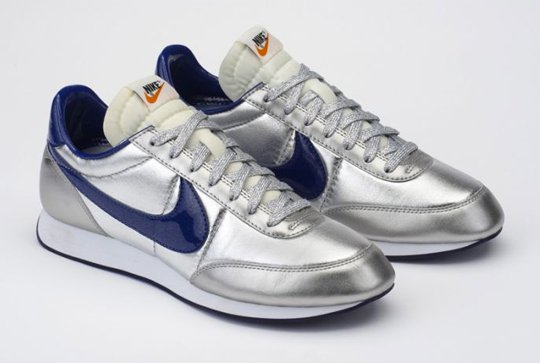
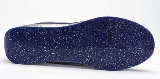
Nike Air Tailwind Night Track NRG ‘Disco’ – colette Exclusive
The sneaker will be launched at the colette Carnaval, celebrating the 15th anniversary of the Parisian concept store. During the 4pm dance class, hosted on the day of the carnaval, March 11th, you will be able to buy the sneaker.
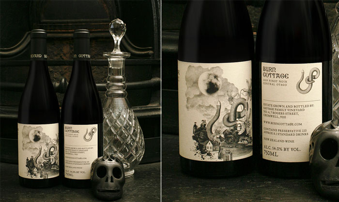
Burn Cottage Wines
“The founding father of biodynamics agriculture, Rudolf Steiner, was influenced by the writings of Von Goethe and in particular, ‘The Green Snake and the Beautiful Lily’ published in 1795. This is a story about the combining the ‘ideal human being’ in everyone with ‘outer life experiences’, the two working in harmony. ‘The Green Snake and the Beautiful Lily’ was the inspiration Mash needed. The various parts of the story have been put together to create an illustrated collage that forms the basis of the Burn Cottage brand imagery used in packaging, promotion and stationery.”
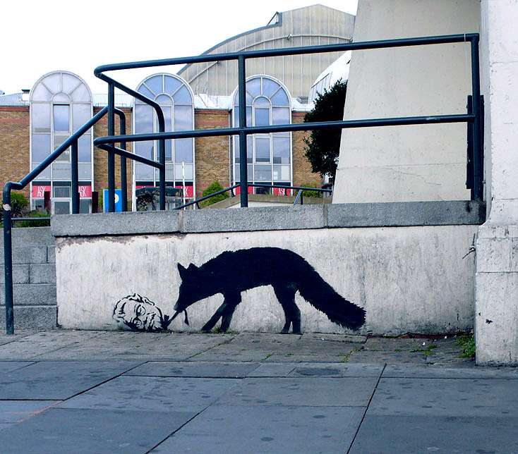
BANKSY ON ADVERTISING
So true!
People are taking the piss out of you everyday. They butt into your life, take a cheap shot at you and then disappear. They leer at you from tall buildings and make you feel small. They make flippant comments from buses that imply you’re not sexy enough and that all the fun is happening somewhere else. They are on TV making your girlfriend feel inadequate. They have access to the most sophisticated technology the world has ever seen and they bully you with it. They are The Advertisers and they are laughing at you.
You, however, are forbidden to touch them. Trademarks, intellectual property rights and copyright law mean advertisers can say what they like wherever they like with total impunity.
Fuck that. Any advert in a public space that gives you no choice whether you see it or not is yours. It’s yours to take, re-arrange and re-use. You can do whatever you like with it. Asking for permission is like asking to keep a rock someone just threw at your head.
You owe the companies nothing. Less than nothing, you especially don’t owe them any courtesy. They owe you. They have re-arranged the world to put themselves in front of you. They never asked for your permission, don’t even start asking for theirs.
– Banksy
Ithaca Audio: Walking in your mind (live mashup)
Walking in your mind (live mashup) from Ithaca Audio on Vimeo.
12 video live APC40 mashup by Chris from Ithaca Audio
A free audio copy of the mashup is available on Facebook:
facebook.com/ithacaaudio
Tracklist:
Hans Zimmer – Time
Howard Blake/Aled Jones – Walking in the air
Tomoyasu Hotei – Battle without honor or humanity
Snoop Dogg featuring Pharrell Williams – Drop it like it’s hot
Jimi Hendrix – Voodoo Child
Massive Attack – Teardrop
Beastie Boys/Jeremy Steig – Sure shot/Howlin’ for Judy
Jay-z – 99 Problems
Rage against the machine – Killing in the name
Phil Collins – In the air tonight
Max Sedgley – Happy
Led Zepplin – Whole lotta love
Darcel Disappoints 150/15 Exhibition at colette Paris
150/15 from Darcel Disappoints on Vimeo.
NYC-based Aussie designer, Craig Redman, did a very special exhibition over at Paris’s colette store, called 150/15. The exhibition features 150 re-designs of his Darcel character, reincarnated as friends of colette (including Kanye, Anna Wintour, Nicki Minaj, Pharrel, Andy Warhol, Damien Hirst and Daft Punk to name a few), to celebrate the boutique’s 15th birthday. See them in the video above and check the gallery for more.
colette Paris
213 rue Saint Honoré,
75001 Paris,
France
Vans Sk85ive2 Indoor Skatepark Hong Kong
Vans SK85ive2, the first indoor skatepark in Hong Kong, was opened on February 18th, 2012 in an industrial building in Kwun Tong, Kowloon. SK85ive2 is a collaboration between sneaker brand Vans, and the popular skate shop 85ive2, that has its main store in Causeway Bay. SK85ive2 consists of numerous ramps, transitions and ledges, as well as a pro shop selling skate gear.
adidas Spring 2012 Tobacco OG
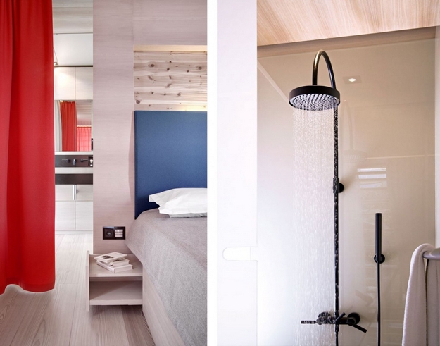
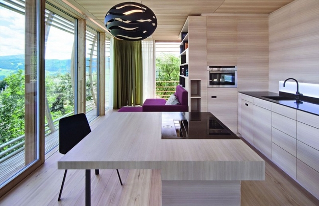
Fincube By Studio Aisslinger
It is a nomadic home that an easily be dismantled and rebuilt on a new site. The prototype of this small and transportable house is located in Ritten, South Tyrol, Italy.
Natural high-techì is the concept of this new modular, sustainable & transportable low-energy house. Made entirely of local wood, the building provides 47 m≤ of living space with a minimal CO2 footprint: local suppliers and local crafts using local long-lasting and recyclable materials manufactured with the precision and care of tyrolese handwork. The Fincube is a materialized vision of a small housing unit with a long lifecycle. It can easily be dismantled and rebuilt on a new site, and even more important for nature hideaways: it requires minimum soil sealing – just 2 m≤ that are easily renatured after the Fincube is moved to another location.
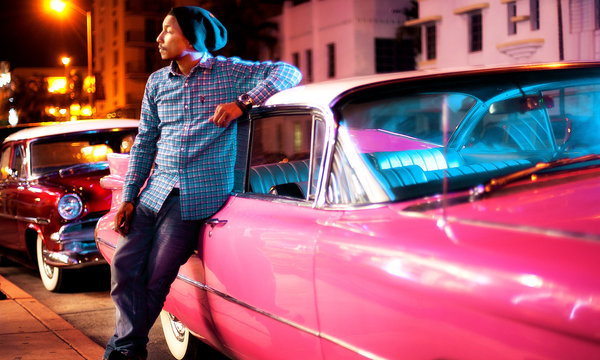
The New York Times: A Week with Pharrell Williams
WEDNESDAY, FEB. 15 In Miami, it’s usually warm, but I’m mostly indoors. I started off my day wearing a Billionaire Boys Club white crew neck T-shirt, blue denim jeans and SpongeBob SquarePants toe socks. I love SpongeBob; I just think he’s funny. Squidward is my favorite, though. If he was a human, I would hang out with him. I had a photo shoot scheduled with my good friend Nigo for his brand Human Made and we decided to have the shoot at my apartment. I modeled a lot of the clothes, which pay homage to the very early Levi’s cuts, and ended up really loving these striped shorts. They were simple but the fit was awesome. I tried to take it from Nigo, but he said he needed it.
After the shoot, I headed to the studio to meet up with Diplo. Kept on the jeans and changed into a blue flannel shirt, black N.E.R.D. logo skullcap and my custom Timberland six-inch black leather boots. I drew on the boots with white and red Sharpie paint pens. It’s a bit American mall rat- and punk-influenced: some cartoon graphics and a small Chanel CC logo. After, I stopped by one of my favorite stores in Miami, the Webster. The owners have great taste and they carry Chanel. I’m a really big fan.
THURSDAY, FEB. 16 A very rare day off. Aside from a few conference calls, I spent it at home with my family, so just put on a Gap white V-neck T-shirt, gray sweat pants and my oversized Mickey Mouse yellow slippers.
FRIDAY, FEB. 17 Off to New York for a photo shoot. I wore my black leather jacket: a biker style and a collaboration between Junya Watanabe Comme des Garçons and Vanson. Nigo introduced me to Junya Watanabe’s designs a few years ago and I’ve liked Junya’s sensibility ever since: out of the box, but not trying too hard. I added a blue and red flannel shirt and a black skullcap. Our next destination was L.A. To prevent myself from getting sick on the plane, I wrapped a Junya plaid and camouflage print scarf around my neck.
SATURDAY, FEB. 18 First session of rehearsals for the Oscars today. The weather was beautiful and sunny so I wore a Human Made logo T-shirt, RRL blue selvedge denim jeans and my black Lanvin sunglasses. On my feet were the six-inch Timbs. I’m a creature of habit. You can always expect the temperature to drop at night here in L.A., so I brought my blue Mark McNairy workman’s jacket with me.
SUNDAY, FEB. 19 Day 2 of rehearsals at Capitol Records. Still can’t believe that I have the opportunity to be involved. Hans and I collaborated, but it’s mainly his world, which is like a university. I’m just lucky that I got a full scholarship. Wore my default outfit: a Billionaire Boys Club white V-neck shirt, blue jeans, black N.E.R.D. logo skullcap, Junya Watanabe black leather jacket and the Timbs with red laces. Tied a gray and red flannel shirt around my waist. Grunge, baby!
MONDAY, FEB. 20 Presidents’ Day. Worked with Corinne Bailey Rae in one room and my new hip-hop artist Buddy in another room. I decided to wear a gray V-neck shirt, navy hoodie, black RRL jeans and black low-cut Chuck Taylor sneakers. I also brought along an Hermès Haut à Courroies bag in camel. I use it for my computer.
TUESDAY, FEB. 21 Another session today with Corinne. We spoke yesterday on doing another track together. I went to the studio wearing an olive Billionaire Boys Club V-neck T-shirt in this super soft pima cotton, jeans and tan Timberland chukka boots. (I also drew a small Chanel CC logo on this pair.) After, I had to attend a dinner party at the Chateau Marmont. I wore a white V-neck shirt and dark blue Ralph Lauren denim jeans. Over that was a gray Junya blazer in this wool sweater material. It also had brown suede front pockets and elbow patches. On my feet, I had on black wingtip boots, a classic style but bright yellow soles. Lastly, I put on this white gold and diamond ring, superoversized — you know, for the sake of fashion.
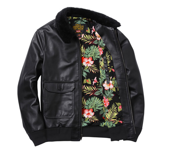
Supreme + Schott NYC Leather Flight Jacket
The New York brand has teamed up once again with Schott. They present a leather flight jacket with fur collar in brown and black versions this season.
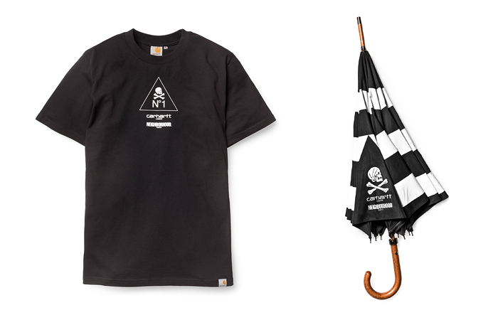
NEIGHBORHOOD + Carhartt WIP 2012 Capsule Collection
Carhartt – Work In Progress collab with NEIGHBORHOOD came about with Carhartt’s new store opening in Shoreditch of London. The pieces will be available from March 1st in London/Shoreditch, U.S.A./New York City, Australia/Sydney Carhartt Stores, and Hong Kong/EXI.T.-Honk Kong. I just want the umbrella.
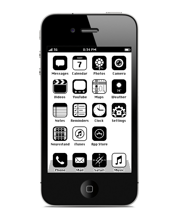
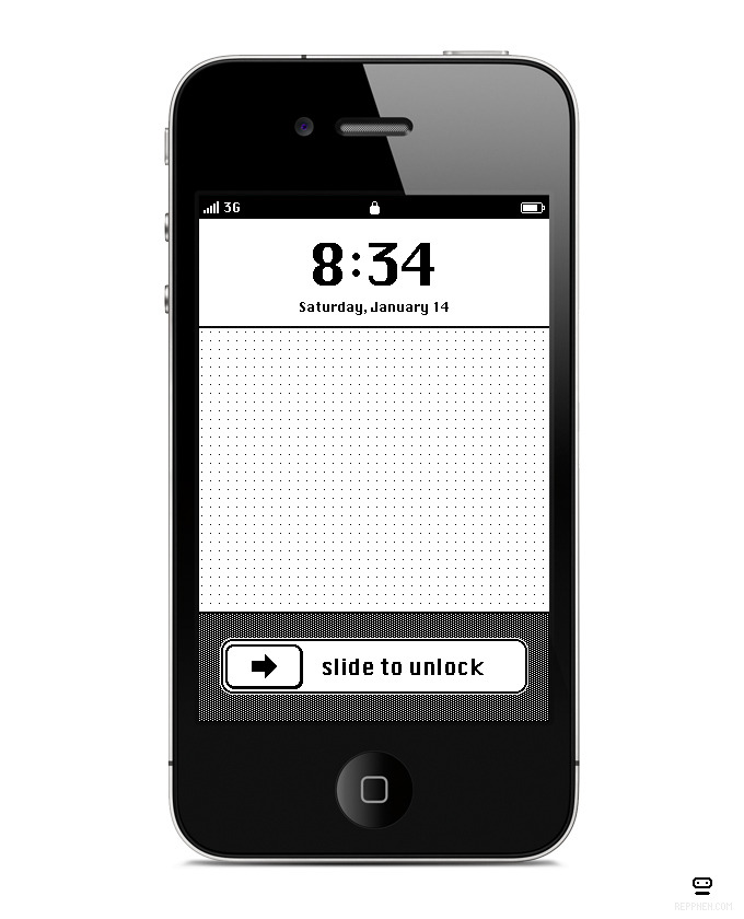
Would you like to install iOS ’86 on your iPhone?
This is so cool! Not all of you would have experienced the old Apple computer layout. Where it took 5 maybe 10 minutes just to boot up the computer and it crashed a few times a day. But either way, it’s refreshing to see this old design used on the iPhone. It’s so clean and simple with out all the colours, gradients and effects. This steampunk retro mobile design by Anton Repponen is not for sale at the iTunes Store, it’s just a beautiful showcase. Damn! I’d like to give it a crack and see if I enjoy it more than the new design.
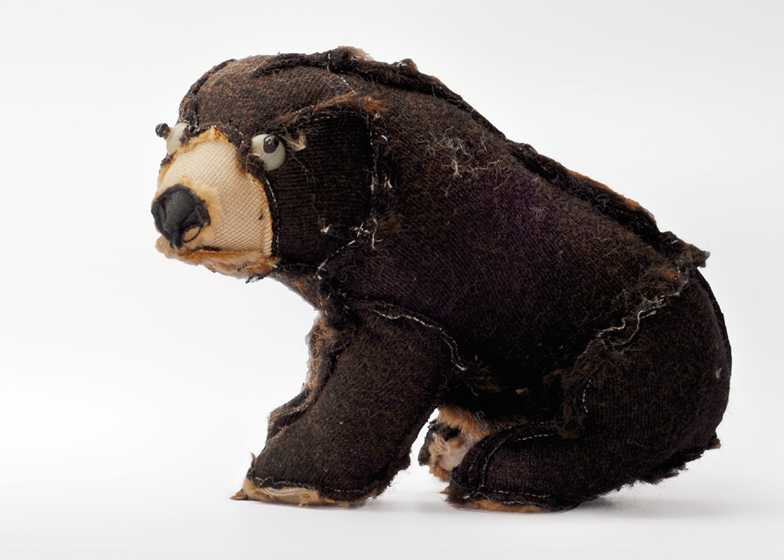
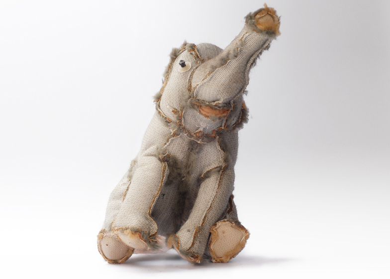
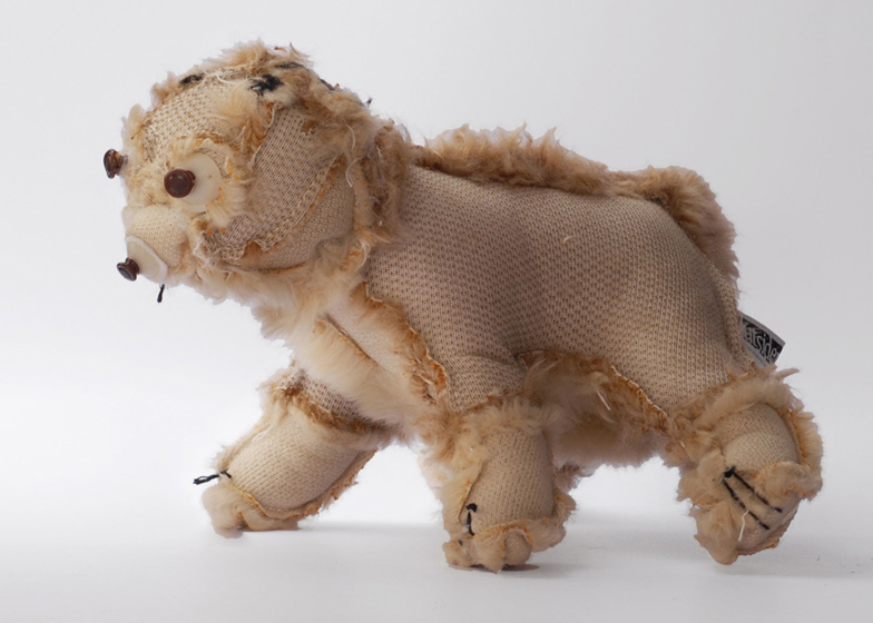
Outsiders Plush Toys by Atelier Volvox
Zurich designers Atelier Volvox rescued these unloved plush toys and gave them a new lease of life by turning them inside out – eyes and all. Samuel Coendet and Lea Gerber collected the toys from second-hand shops and forgotten corners of nursery schools before cutting them open to reverse the fur. What a genius idea and a great way to recycle.
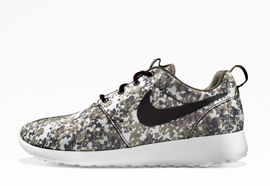
Nike Roshe Run ‘Camo’
The new Roshe Run is technically inspired by the Free technology. Bringing together a performance and lifestyle sneaker. Due to drop July 2012.
Lyonheart K By Classic Factory
Powered with a 5.0 litre Supercharged V8 engine delivering a staggering 550PS and 680Nm of torque, Lyonheart K is built around a state-of-the-art aluminium chassis covered with carbon fibre panels. The weight is under 1600kg, which gives Lyonheart K rocket-fast performance: 0-100kph under 4 seconds. Top speed is electronically limited to 300kph.
Facebook Redesigns Groups To Be More Timeline-y and Purposeful, Less Spammy
TechCrunch Article –
Facebook has rolled out a limited redesign of Groups, featuring a big new Timeline-style cover image, and a prompt for users to prominently label “What should people post in this group?” See, if you’re not careful, your intimate Facebook Groups can balloon in population and stray off topic generating annoying notifications for everyone.
This redesign makes Groups feel more close knit, and will encourage them not to devolve into a chaotic array of kitten photos, political diatribes, and self-serving announcements. After all, that’s what the news feed is for.
Groups previously displayed a small “group image” that admins could upload. I bet people often chose some generic clip art or a photo that appeared too tiny to be meaningful. Now the top of Groups looks more like Timeline, with a sweeping banner image that defaults to a collage of members but can be replaced with any image. Cleverly, the default collage shows the most recent members to post to the Group.
The redesign also makes links to members, photos, events, and docs more obvious. This is thesecond time Facebook has increased the prominence of these links to draw usage and compete with Google Docs as a collaboration tool.
Since Groups launched in October 2010 users have been able to add a description. However, they were provided no prompt as to what to enter, and likely just noted a theme rather than a purpose. Now a prompt and input field for group guidelines are immediately visible in the right sidebar.
This little prompt to display “What should people post” might not seem like a big deal, but if you’ve ever been in a big noisy Facebook Group, you probably wanted to tell everyone to shut up until you muted its notifications. Then you ceased to be alerted to the few useful posts and forgot all about the Group.
When I started a Group called SF Socialites soon after the product launched, I knew I had to keep noise to a minimum if people were actually going to use it to hear about cool local events. So I added the description “We keep posting volume low so you can leave notifications on. Check the Docs for guidelines”, then laid out ground rules in a doc that prohibited self-promotion, asked people to comment and post only when necessary, and detailed how I’d kick you out of my sweet Group if you annoyed people.
Eighteen months later and the group now has 280 members, no spam, and has led to some epic last minute meet-ups at concerts because people don’t mute it. Hopefully Facebook users heed the new description prompt, create focused discussion and collaboration spaces, and get as much out of Groups as I do.
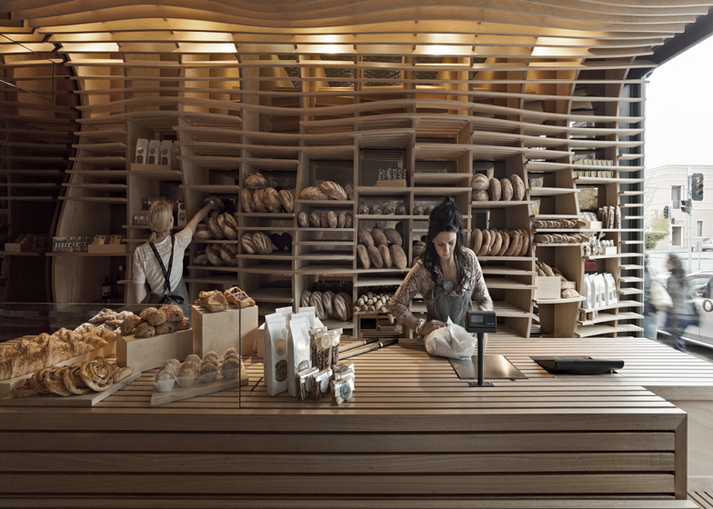
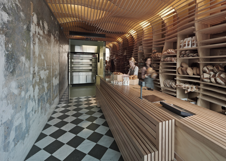
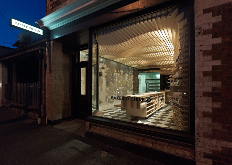
Baker D Chirico by March Studio
Australian practice March Studio conceived this Melbourne bakery as an oversized breadbasket. The undulating wooden slats that cover the rear wall and ceiling of the shop function as shelves for storing and displaying breads of different shapes and sizes. A wooden chopping board spans the length of the bakery to create a countertop with integrated pockets for scales, knives, crumb-catchers and checkouts. March Studio were also the designers for a series of unusual shops for skincare brand Aesop.
Source
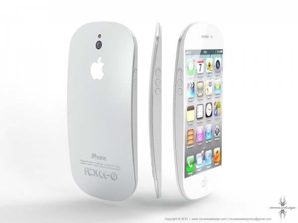
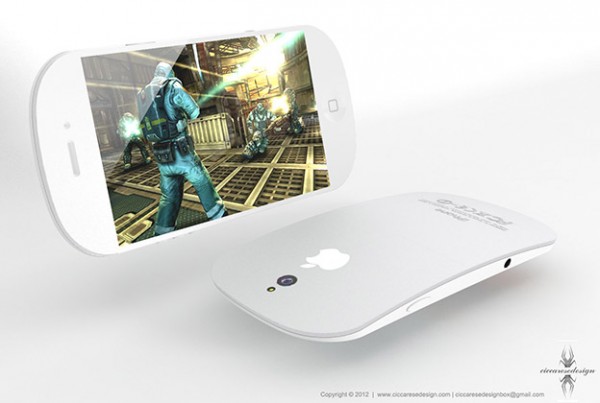
iPhone 5 Concept by Ciccarese Design
A new iPhone 5 concept was recently created by Italian designer Federico Ciccarese that closely resembles a magic mouse.


